Community of Grace

Community of Grace Lutheran Church
A church that took a risk to tell a more authentic story about itself.
Lutheran churches are to the northern states of Minnesota and the Dakotas what Baptist churches are to the South. There's just about one on every corner, and in White Bear Lake, a suburb of St. Paul, this particular congregation had the distinction of being the First English Evangelical Lutheran Church (later shortened to First Lutheran Church) for nearly 90 years.
In today's modern era, however, being the "first church" of any long-standing denomination doesn't hold quite the same sway that it once did. First Lutheran's leadership recognized that the name had unintentionally become a barrier to people outside the church in their community.
It was time for a fairly radical change – radical because at least half of First Lutheran's congregation are senior adults and quite conservative – a change to a new name and brand that would be more telling of the kind of open-armed community found within its walls. A new identity that spoke to the kind of love and grace that could be experienced through Christ in this uniquely intergenerational family of believers.
From the very beginning, the Christian Church, the people of Jesus, have been a community of God’s grace.
— Pastor Steve Turnbull
Brand Story
Through listening, thoughtful conversations, an in-person site visit, and asking the right questions, I was able to establish the framework of the story Community of Grace had to tell:
- Grace invites each and every person and welcomes them into God’s family.
- We gather to celebrate our unity in Jesus in different ways.
- Engaging in Christian community helps us all to look a little more like Jesus.
- We go beyond the walls of the church to love and care for our neighbors on the outside.
Brand Design
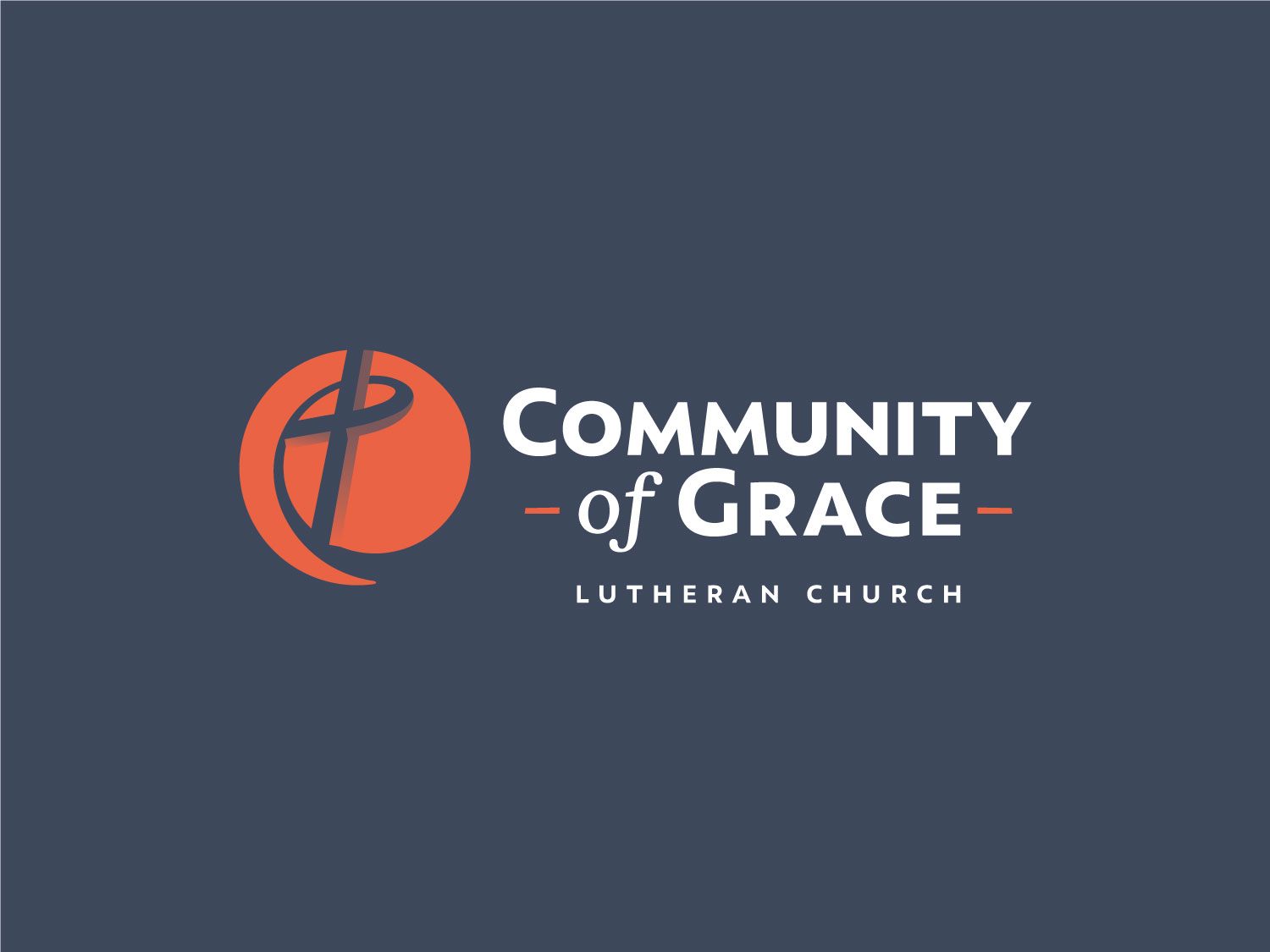
This shared understanding of Community of Grace's story helped pave the way for creating a modern design that serves as a welcome invitation to their neighbors while remaining faithful to the message of grace through the cross. The circle emblem represents Community of Grace as an accepting and welcoming multi-generational family. I paired this with a clean, geometric sans-serif typeface to anchor the brand with a bold, engaging voice, while the corresponding serif italic typeface is a simple nod to the rich heritage as First Lutheran Church. The dynamic orange brand color is meant to inspire people to embrace the change that grace makes in our lives and to live impassioned for Christ. The inclusion of a semi-transparent gradient along the lines of the cross adds depth and a dynamic feel when placing the logo over various backgrounds and colors. It is, in essence, allowing that which is not a part of the logo to interact with and become part of the logo, mirroring the church's welcoming posture toward its community.
Business Set
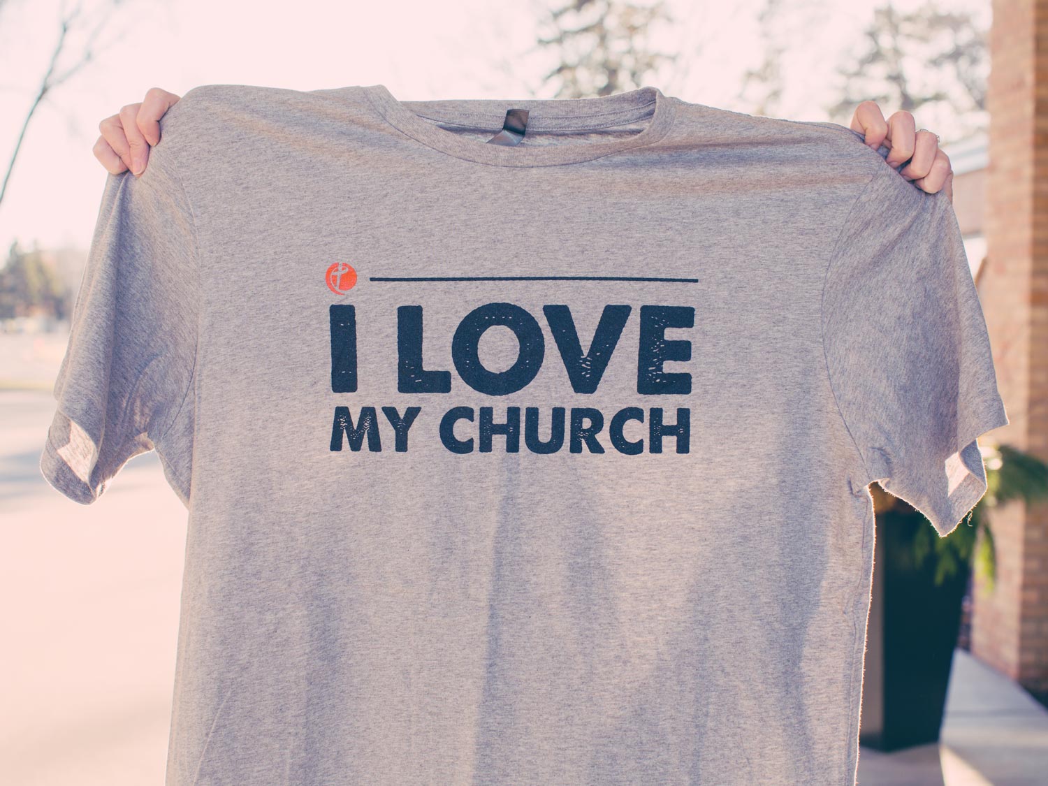
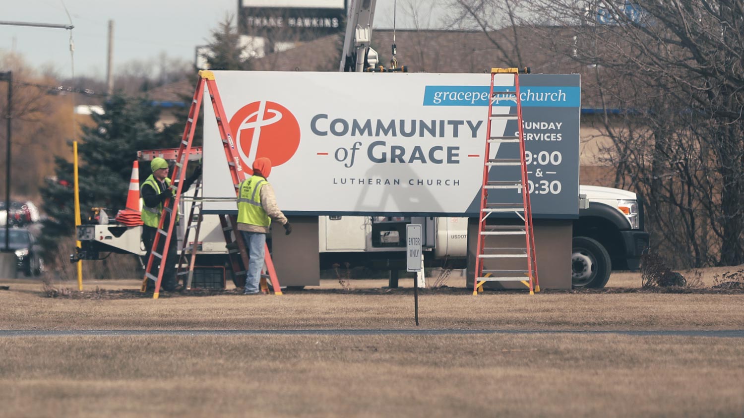
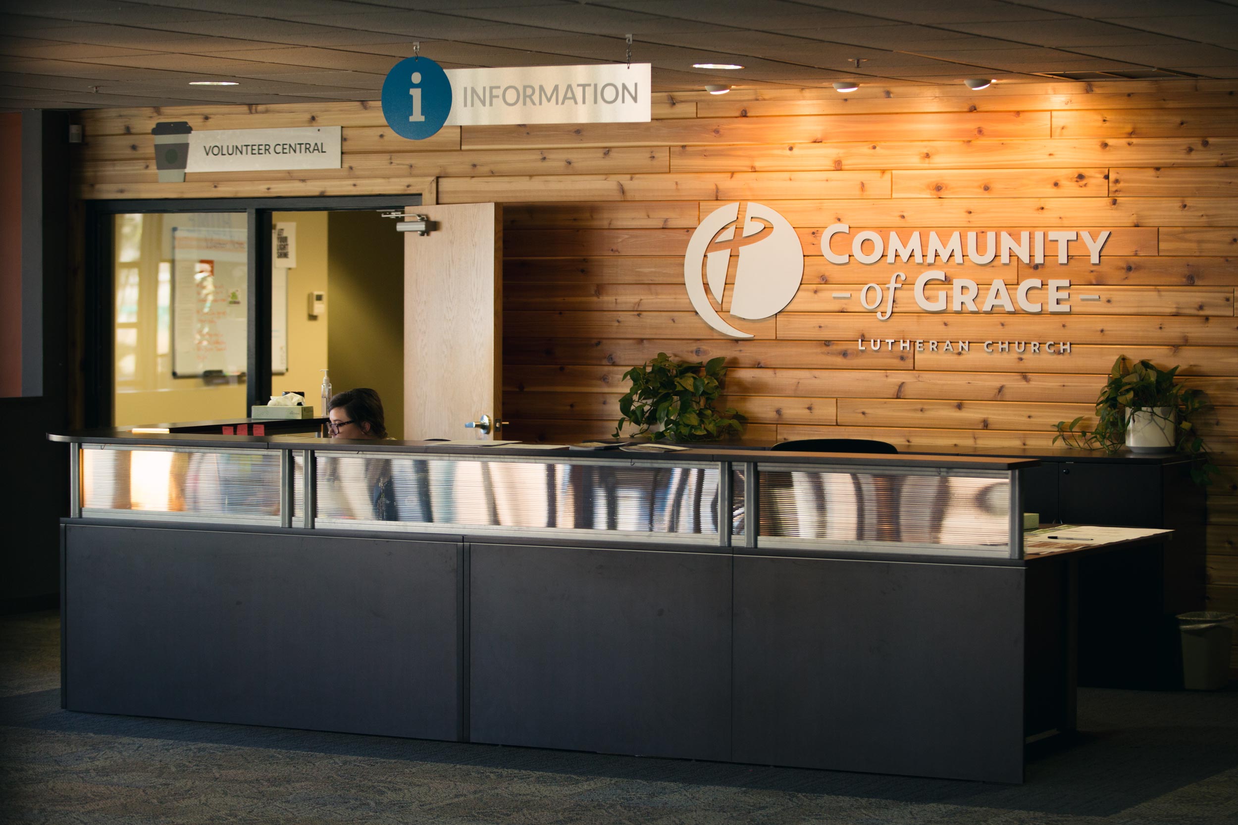
Brand application & Signage
Website Design
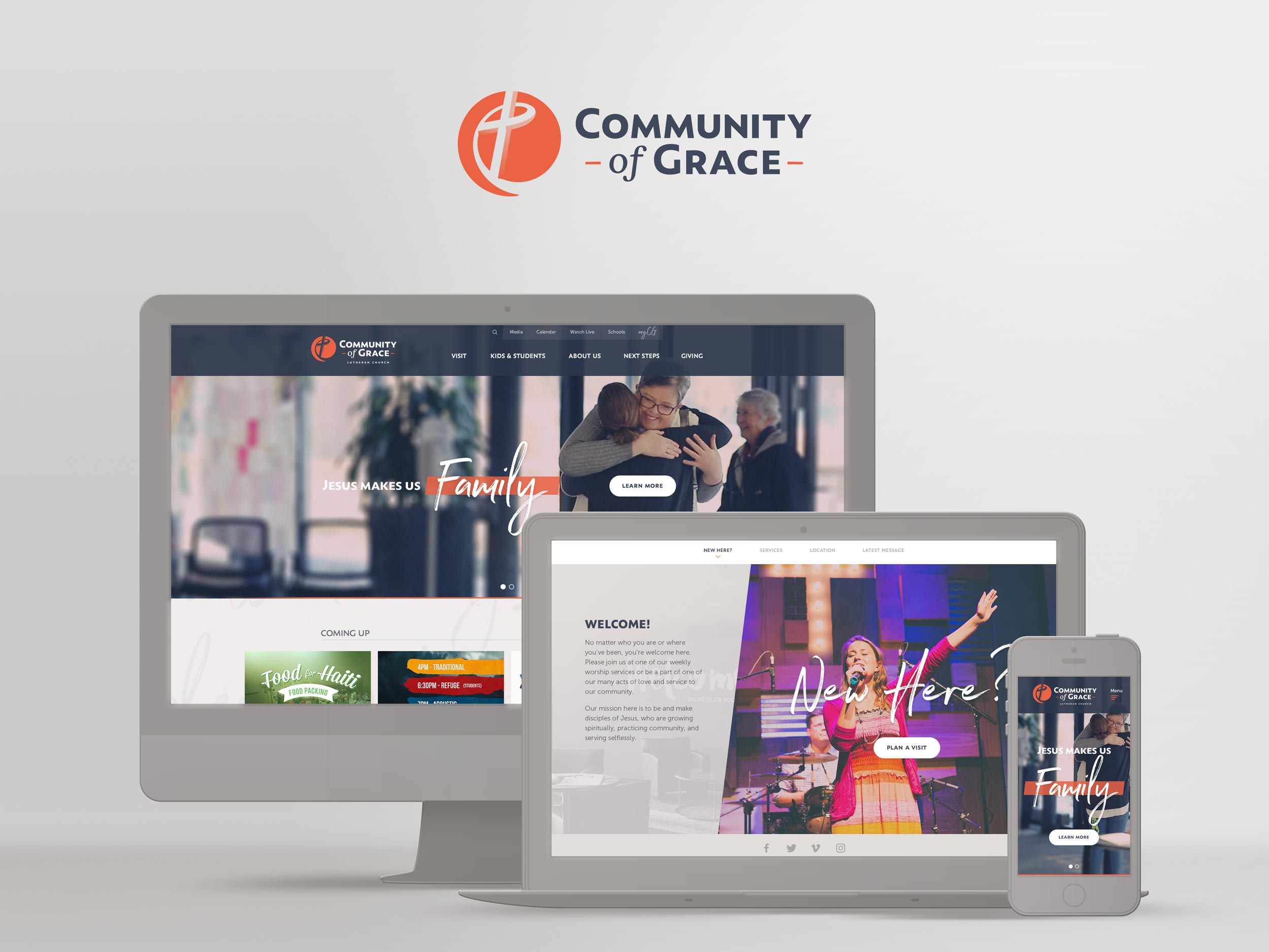
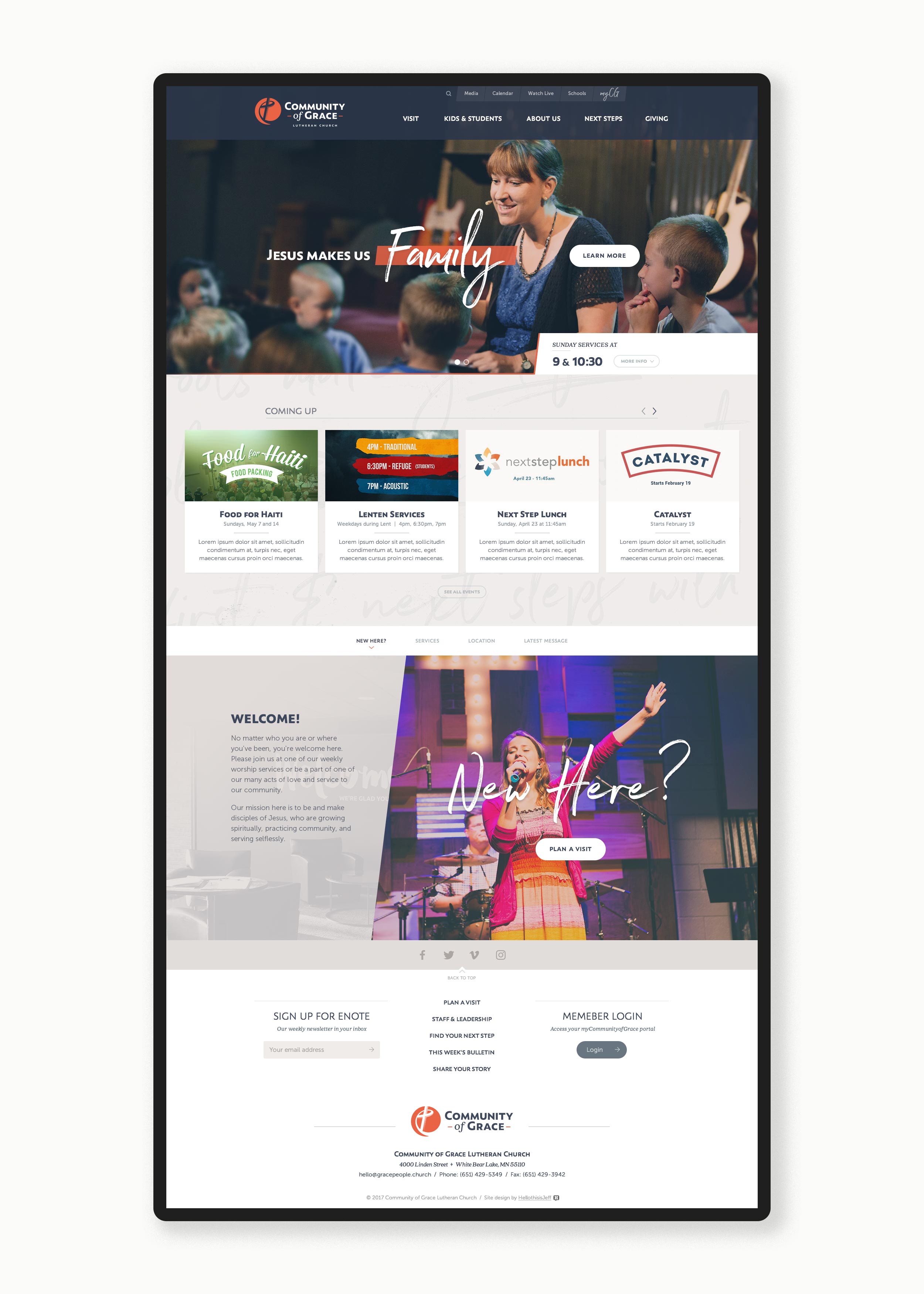
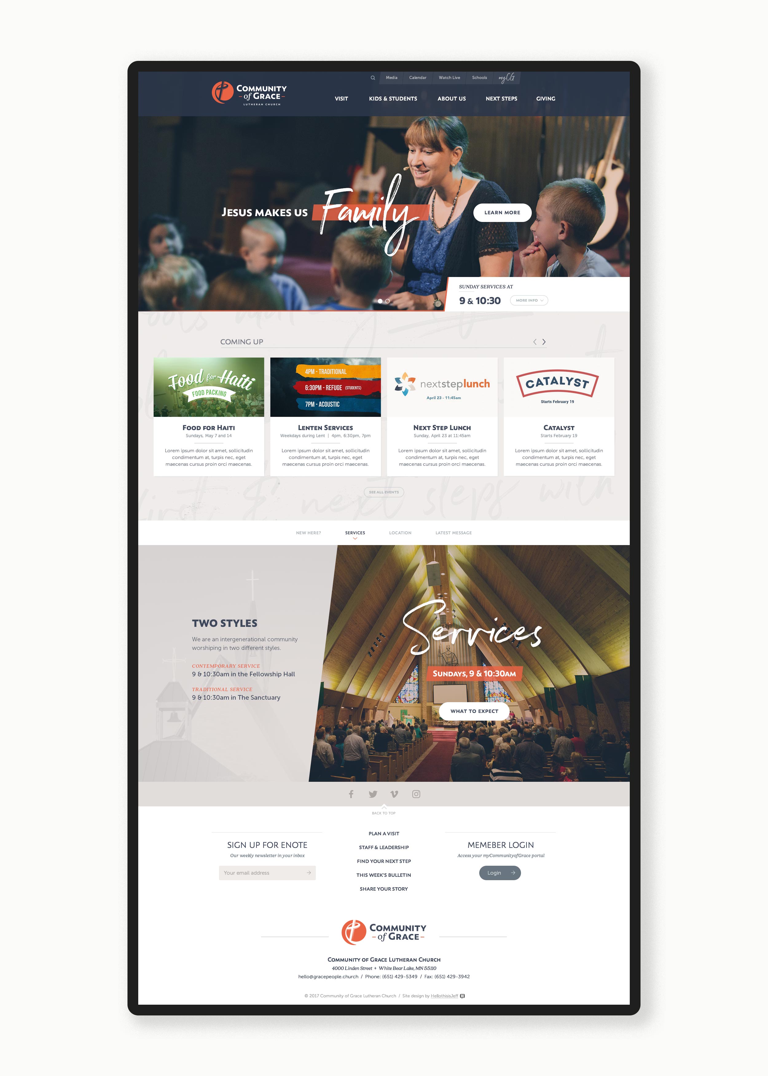
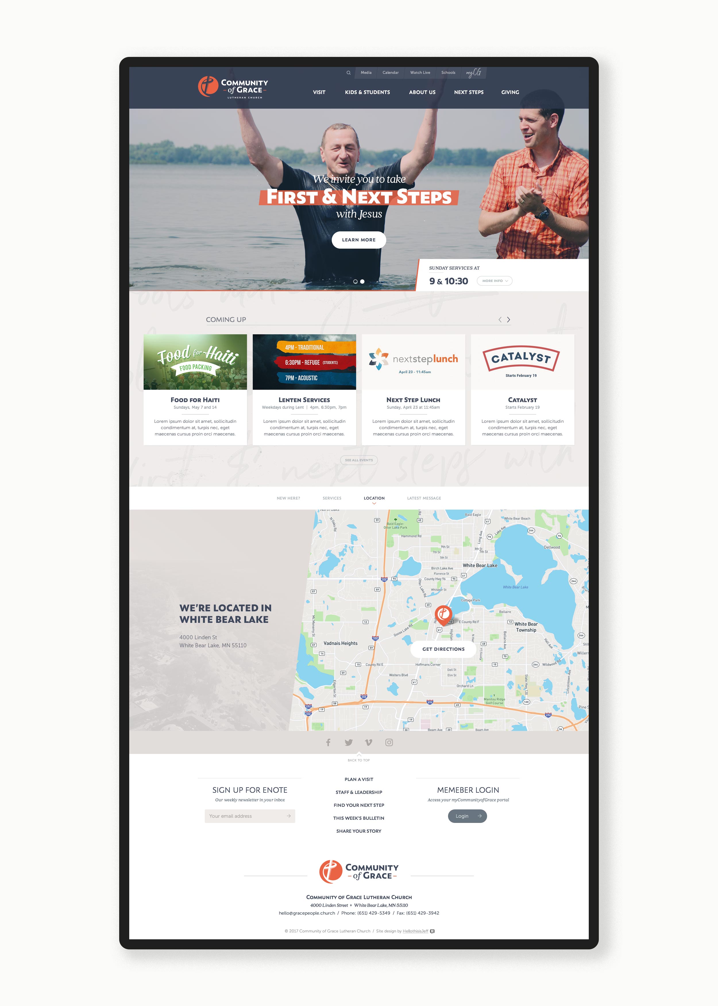
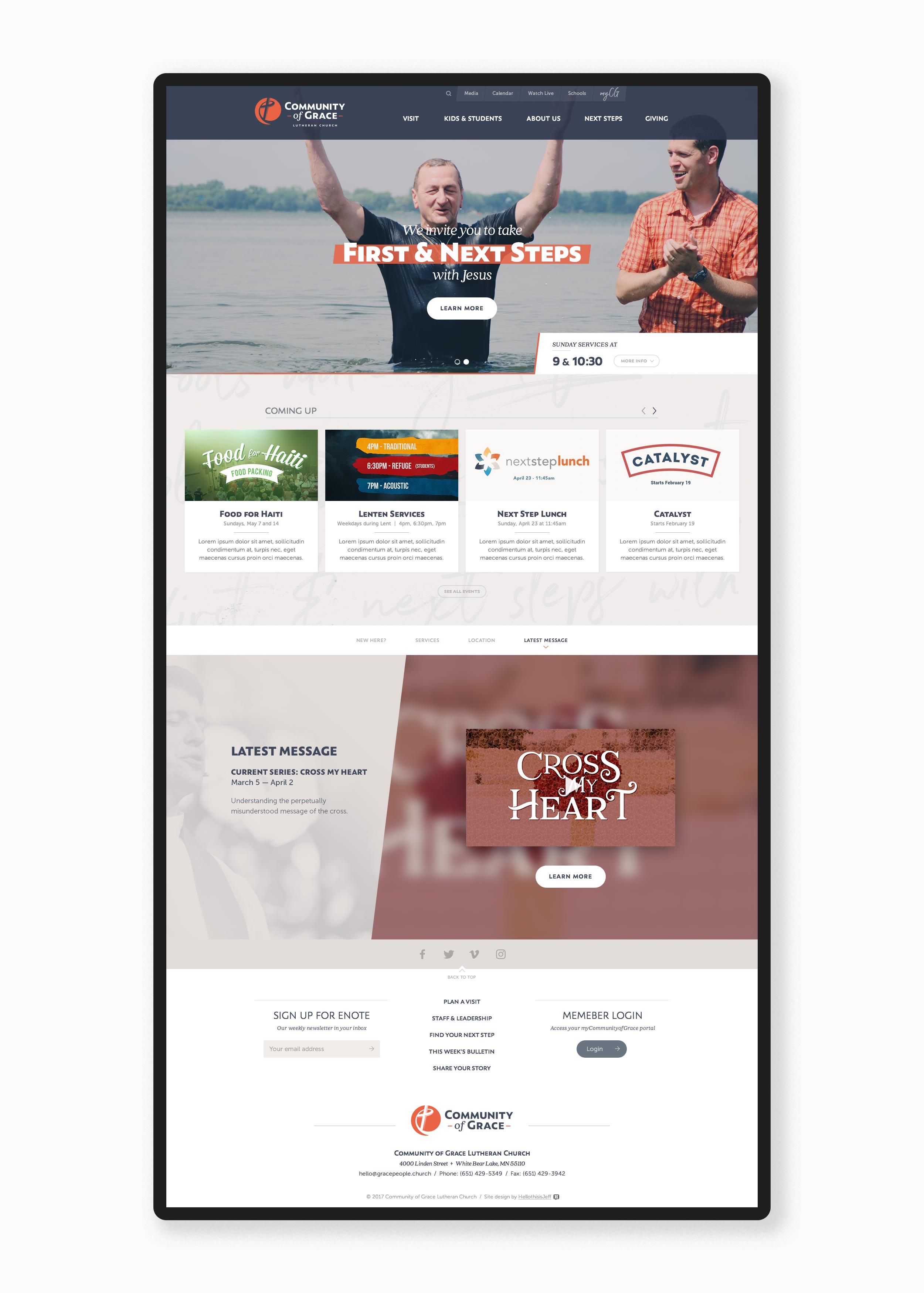
Applying the new identity to a completely revamped website design allowed us even more opportunities to infuse life into the overall brand experience. We used custom photography that the church supplied together with a mix of brand fonts and colors to evoke warmth, freshness, and energy.
For this particular web project, I supplied a number of page template and custom page designs, and worked with my client's preferred web development vendor to ensure the site build was fully responsive and a huge win for the church.
Community of Grace now boasts a modern web presence that outperforms any they've had before. With a newly simplified navigation structure, clean typography, and full-width scalable imagery, Community of Grace is able to better engage people outside the walls of their church.
Email Marketing
To help Community of Grace communicate with its own church family, I set up an easy-to-use email platform with a robust set of features and designed an editable newsletter template that Community of Grace could update weekly with fresh content.
“We had just voted to rename a 130-year-old church. Clarifying our message, building a new brand, and telling our story was critical. Jeff guided us through it seamlessly. We felt completely safe in his hands. We went from no true brand identity, a non-mobile responsive website, and email marketing from the 90s straight to the front lines of the industry standard.”


