Dream City Church

Dream City Church
formerly Phoenix First Assembly
A new name and brand for a new era of reaching people like never before.
In summer 2015, one of the nation's largest churches was ready to take a bold step in a new direction. With a rich legacy in the greater Phoenix metro area, Phoenix First Assembly had flourished under the storied leadership of Pastor Tommy Barnett. The baton officially passed in 2013 to Tommy's son, Luke, who began dreaming about what the church could look like in 10 years when it reached its 100th year.
Time for a change
Luke Barnett's vision included multi-site campuses ministering to 50,000 people weekly, with an expanded focus on small groups, creative arts, and leadership training. Now, two years later, the church was ready to launch their first multi-site campus and begin the charge, but the name Phoenix First proved limited by geography. Also, the existing brand system lacked substance and was becoming far too outdated and fractured to effectively carry the new vision forward.
A place to dream
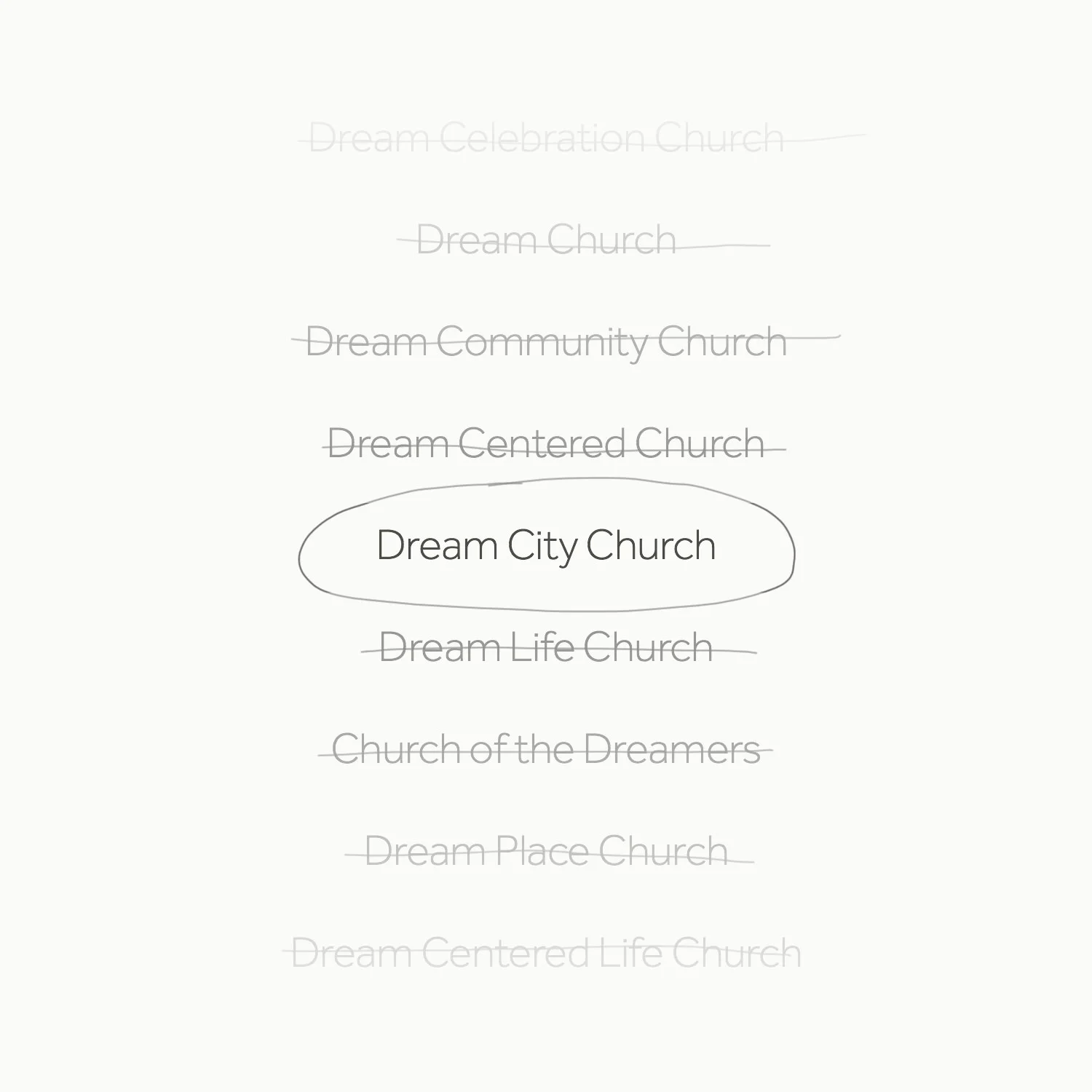
In consideration of what the new name should be, church leaders looked no further than to what Phoenix First was already known for.
Phoenix First has long had a heart for the city through a scalable urban outreach program called the Dream Center Network with individual Dream Centers in cities all across the US and around the world. Their mission from the beginning has been to help people in dire need dream again for their lives.
The church was also known for hosting the Dream Conference, an annual event that drew pastors and ministry leads together from around the country for an intensive three-day training that inspires leaders to dream big.
It was a clear move to carry the dream concept through to the new name and a fresh brand identity for the next chapter of the church's vibrant story.
development
I partnered with church staff and leaders to identify eight key components of their unique brand story which were then used to guide the creative process.
Design
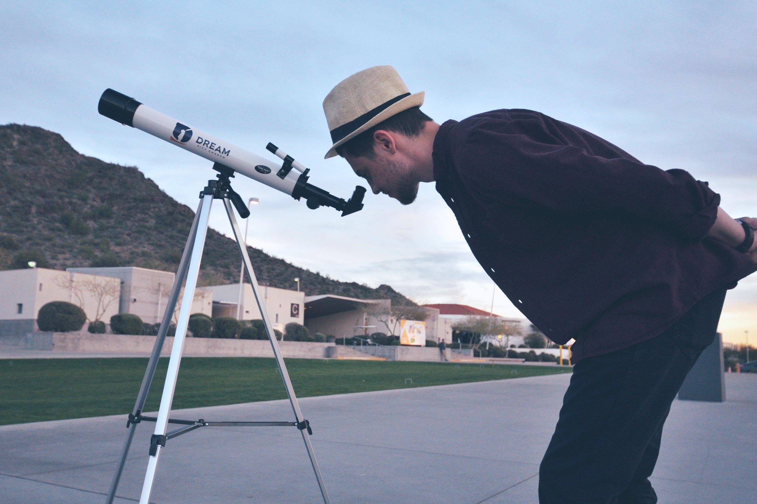
The boy with a telescope is a symbol of child-like faith, hope, and the penchant for dreaming big. Inspired by a previous logo (below left) designed for the Dream Conference, the former boy and telescope silhouette was redrawn and modernized to help it read clearly and carry the Dream City Church brand effectively.
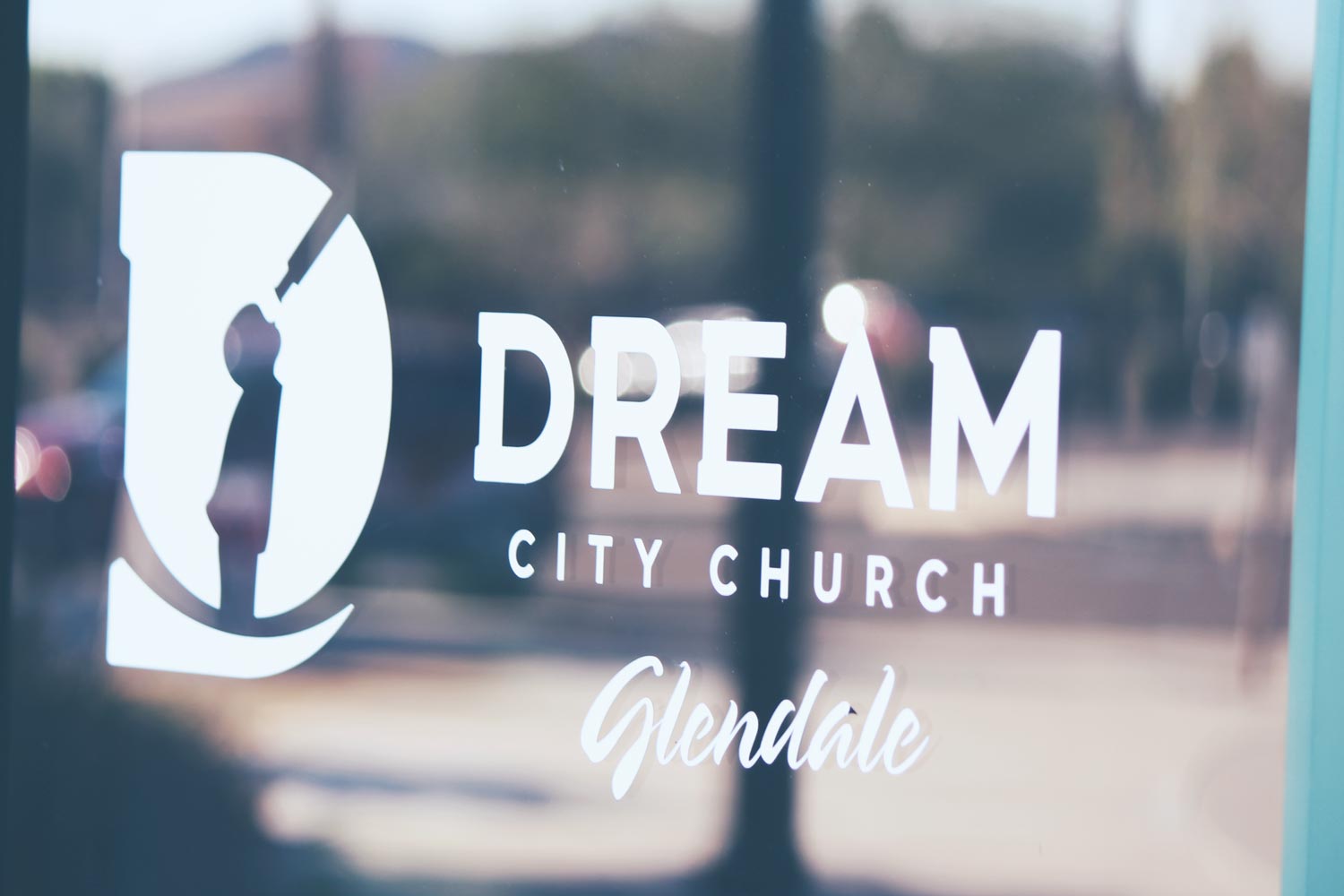
Knocking out the silhouette from inside a bold “D” shape helped create a permanent bond between icon and monogram, to where the “D” immediately reads as “Dream.”
Application
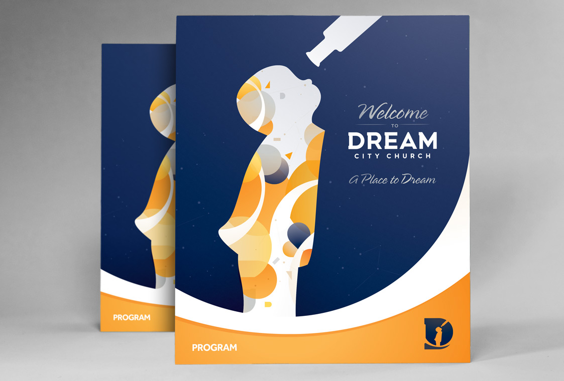
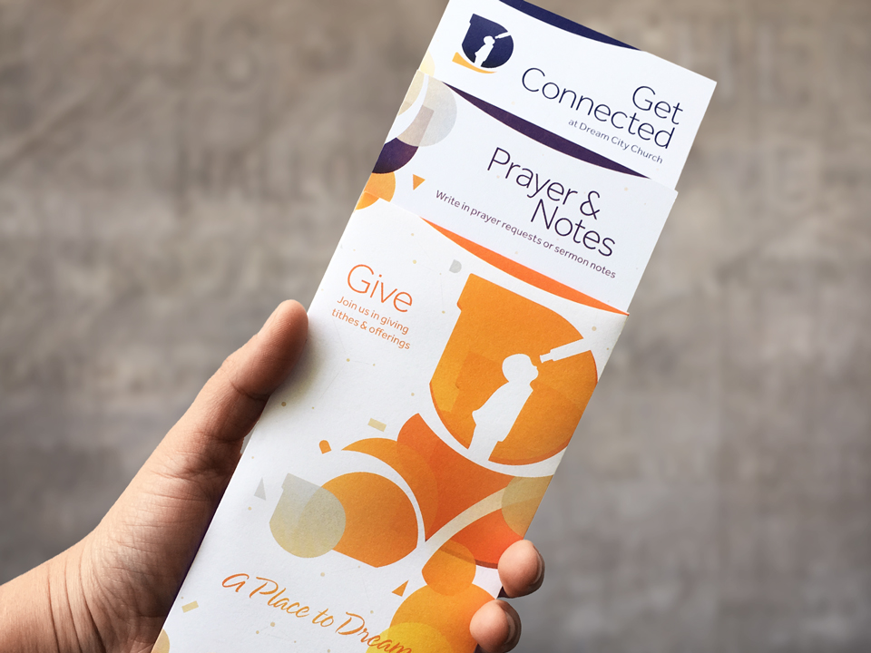
The simplicity of the logo allows it to scale down to a single icon usable in virtually any type of branded communication. Also, the boy and telescope silhouette and negative space shapes from the logo were combined in a variety of compositions to create endless "dreamscape" motifs.
The central theme around which to build the brand was already there. It just had to be assembled in a way that felt true to their identity — namely, that this is a place to dream.
Safeguarding the brand
The final step was to put together a comprehensive brand identity system guide book which clearly spelled out Dream City's vision language along with instructions on how to effectively put the full identity system to use.
Result: A new era begins
With a new name and a comprehensive branding system by HELLO THIS IS JEFF, Dream City Church is now positioned to reach more unchurched people than ever before across its three new regional campuses. The brand system is flexible to allow for future growth while engaging current audiences with a modern and friendly voice.
“The rebrand played a big role in helping us become a multi-campus church. The iconic emblem has provided a stronger identity that has carried through to many of our programs. Since the launch of the new brand, we’ve expanded our church family to Scottsdale, Glendale, and just recently to Colorado City, AZ. The project came with some very tight time restrictions, and despite some of the challenges, Jeff went above and beyond to deliver a brand that helped position us for greater growth.”


