Urban Refuge Church

Urban Refuge Church
In 2020, Urban Refuge found itself at the epicenter of the racial justice movement thanks in part to their location and also their history of standing up for equity and reconciliation.
Drive just a few minutes south from the intersection where George Floyd tragically lost his life, and you will pass right by Urban Refuge Church in South Minneapolis.
Long before this tragedy garnered the national spotlight for police brutality and the unjust treatment of minorities, Urban Refuge was known in and around the community for championing multicultural diversity and racial reconciliation.
But a year and a half after that horrific day, the church found themselves faced with a departing lead pastor, congregational fatigue and in-fighting, and no clear sense of direction with which to move forward. Urban Refuge required a fresh, reimagined brand to inspire deep introspection and help usher in a renewed season of ministry, embracing their community with open arms.
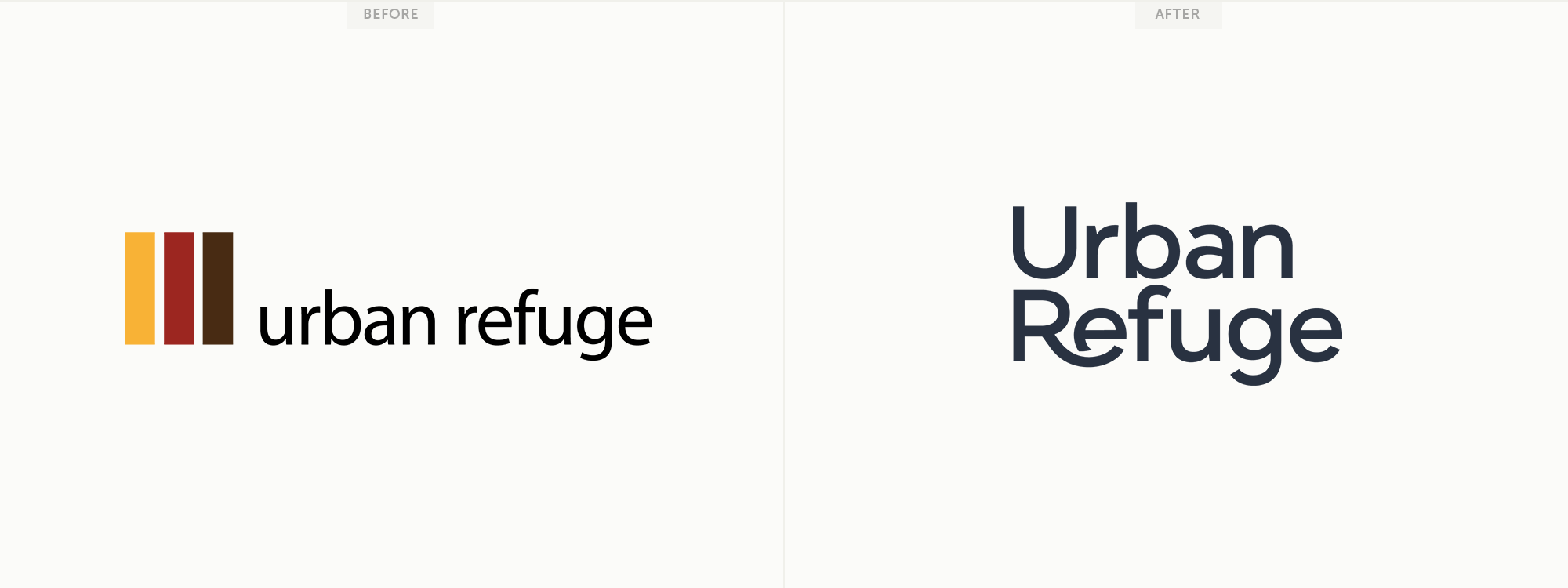
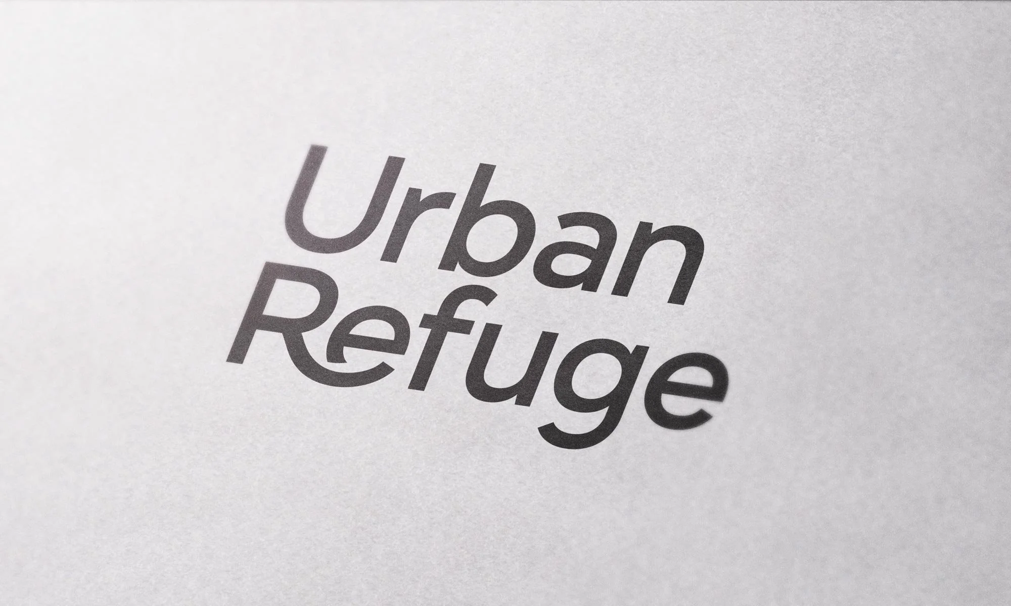
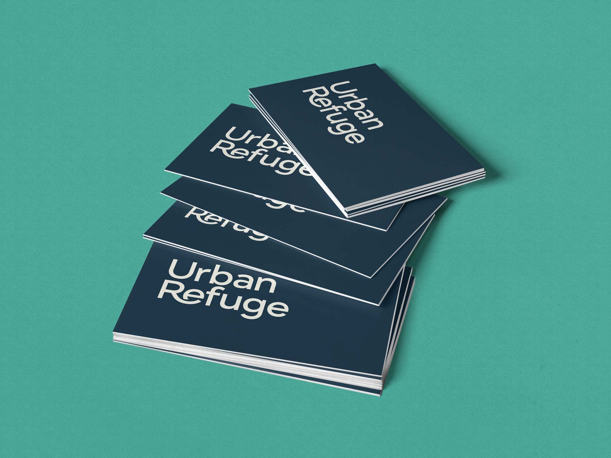
The new Urban Refuge logo design explores the ideas of love, community, unity, and protection from a typographic standpoint. The gently curved leg of the R positions Urban Refuge as a place of safety, healing, and compassion. Keeping both words at a unified size and weight is symbolic of moving past former times of division and opposing direction and beginning a new era of collective movement in a common direction.
The Brand Story Process
HELLO THIS IS JEFF partnered with Urban Refuge to creatively strategize, problem solve, and implement their goals for the new brand, website, and collateral materials.
To see my Brand Story Strategy process in action, please watch the video below which was beautifully put together by Carson Kipfer, Executive Ministry Director at Urban Refuge Church, to announce their new brand to the congregation. Carson expertly walks us through each step of the process so we can clearly see how crafting a central Brand Story is a crucial step to pave the way for the creative work produced throughout a rebrand project of this magnitude.
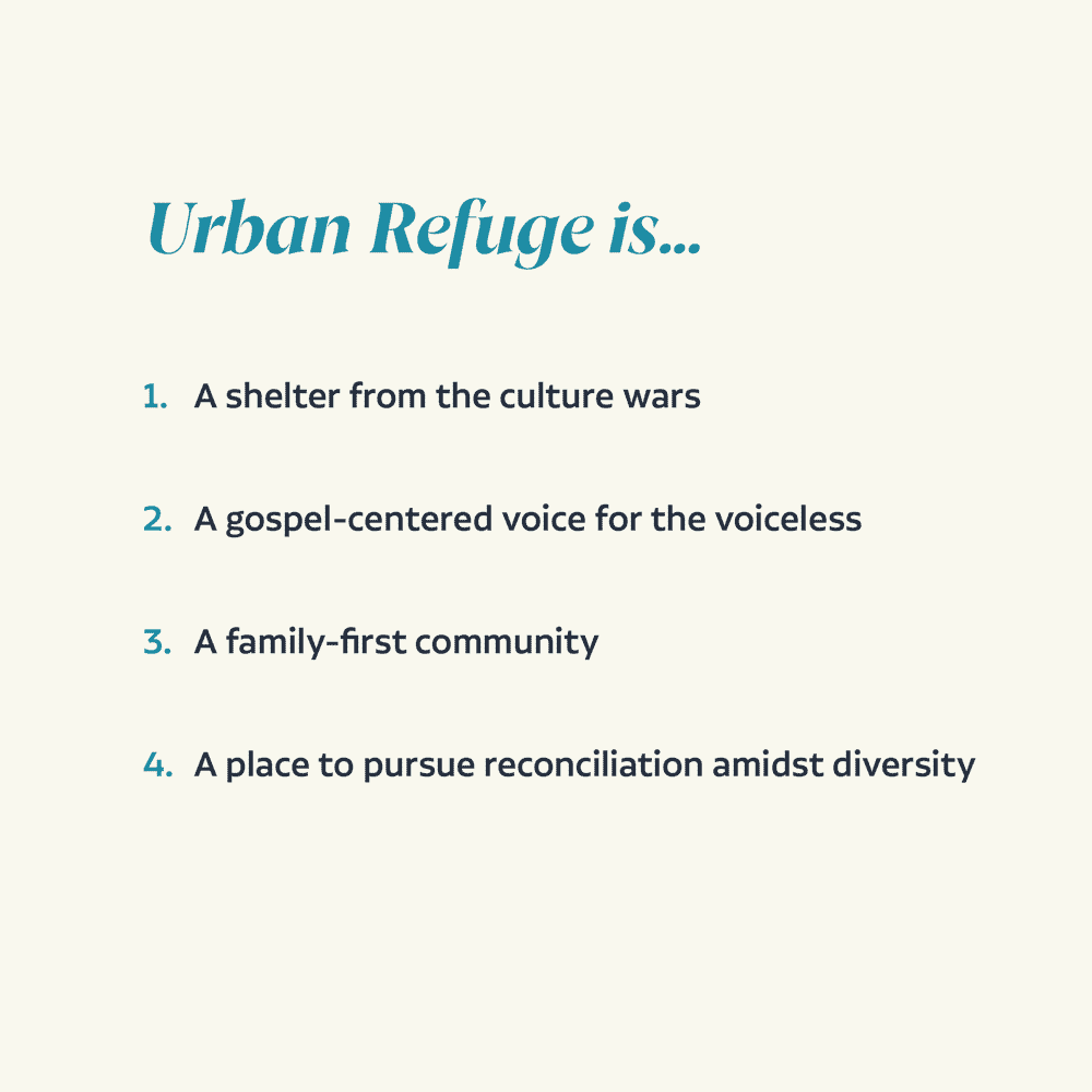
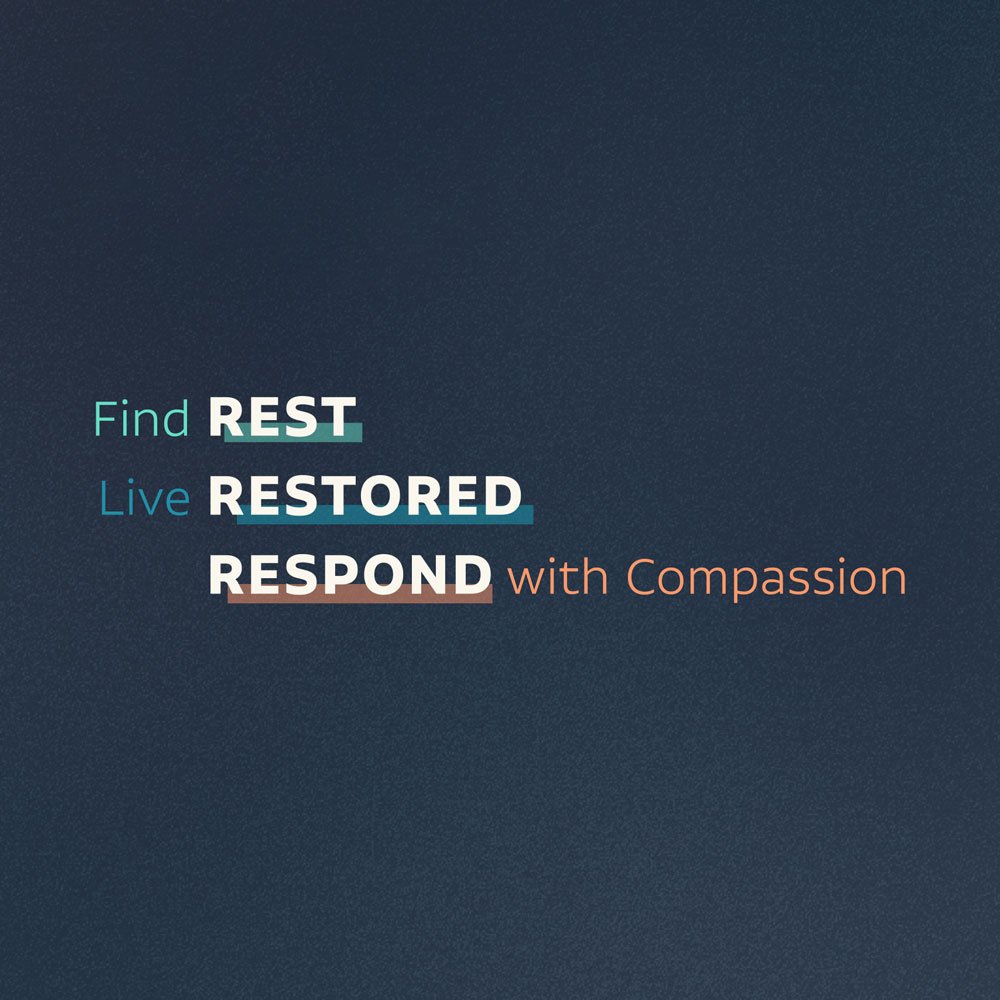
The Brand Story we developed together took into account the key strengths that Urban Refuge was known for along with its present challenges. It also broke down its primary and secondary audiences to better understand what each audience was struggling with, looking for, and aspiring toward. From there, we formulated a plan with which the church could begin to engage its audience, then crafted key brand messages and a one-liner that could kickstart the conversation.
Brandmark Design
The old logo sported three vertical rectangles that, while possibly communicating the three-in-one nature of God, didn’t say much of anything about the church itself. The 70s-era color palette also didn’t help much to communicate a sense of modern-day relevance. While many logo lockups and styles were explored – some with an icon, others without – ultimately, it was the type-only wordmark that best illustrated the love, care, and safety a person could expect to encounter when they walked through the doors of the church.
The brandmark was intentionally designed to be devoid of any strong colors that might distract from the simplicity of the message. In this way, the brandmark could be more adaptable to a variety of colors and applications within the overall brand aesthetic.
Brandmark Construction & Color PaletteBeyond branding the church as a whole, HELLO THIS IS JEFF worked to design complimentary sub-branded logos for Urban Refuge’s kids and youth ministries, as well as providing multiple logo templates for high-level and ancillary ministries within the church.
Kids Ministry Branding
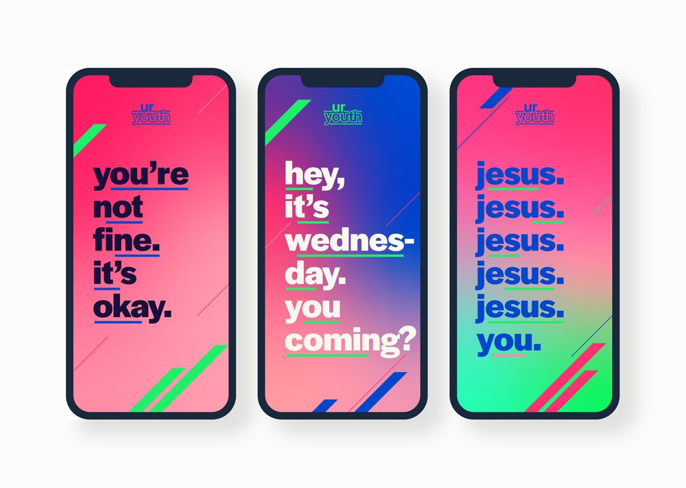
Youth Ministry Branding
Primary Church Ministry Logos
Secondary Church Ministry Logos
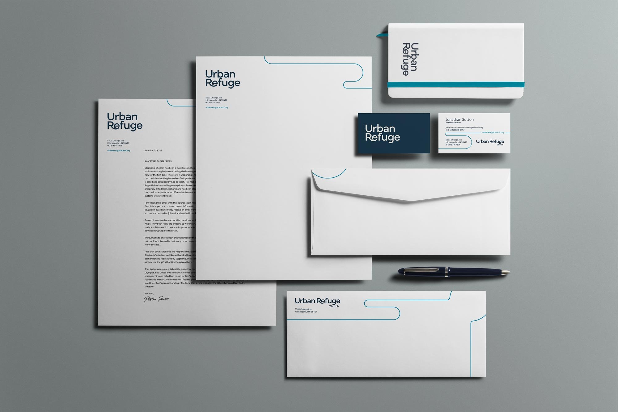
Business Set
Brand Guide
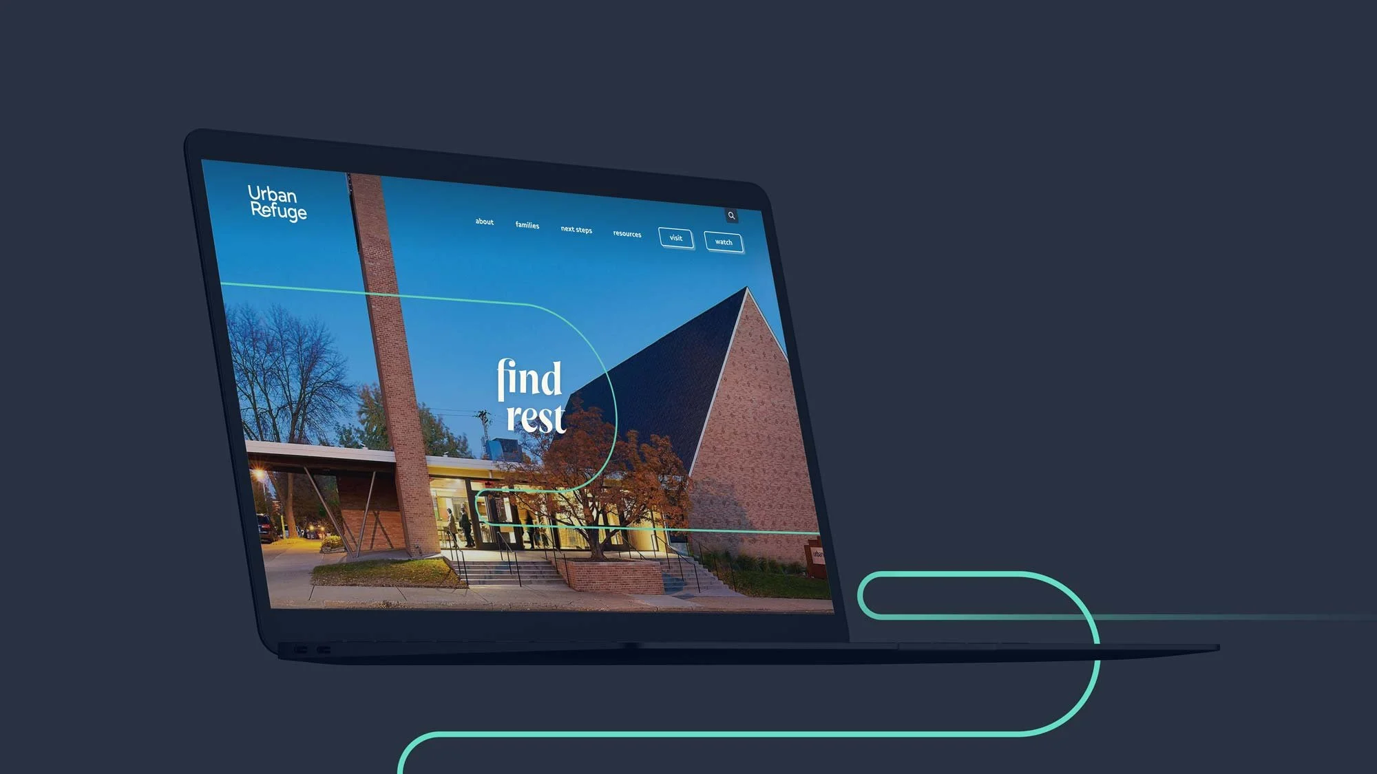
Website Design
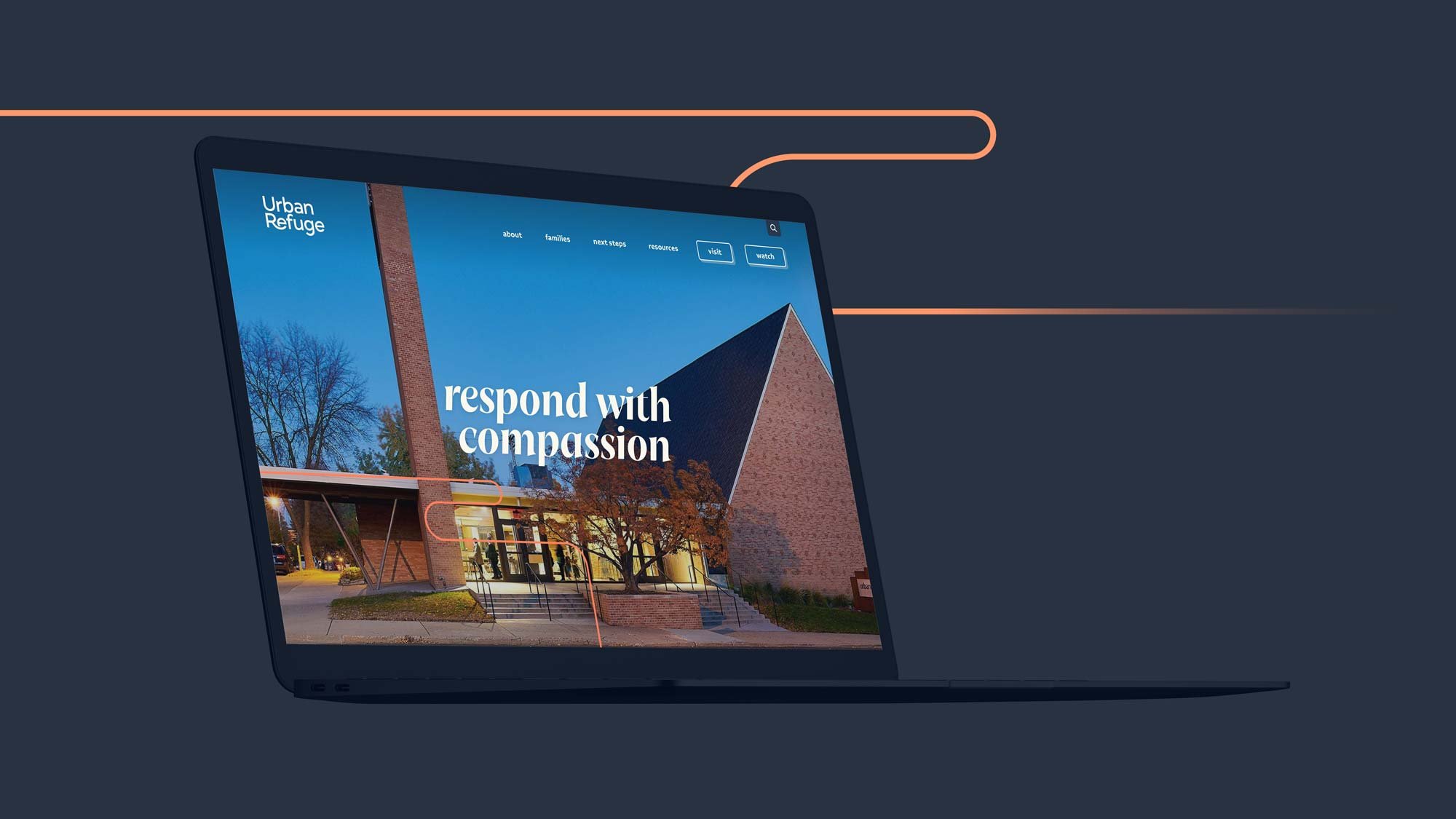
The new site was built completely in Squarespace, and it served as the place where all the colors, fonts, branding, imagery, and messaging came together to create a welcoming and engaging experience for both newcomers and current congregants alike. The goal of the website was to encourage a first step (learning about the church, visiting, or watching online), followed by a next step (discovering Jesus, connecting, serving, membership, etc.).
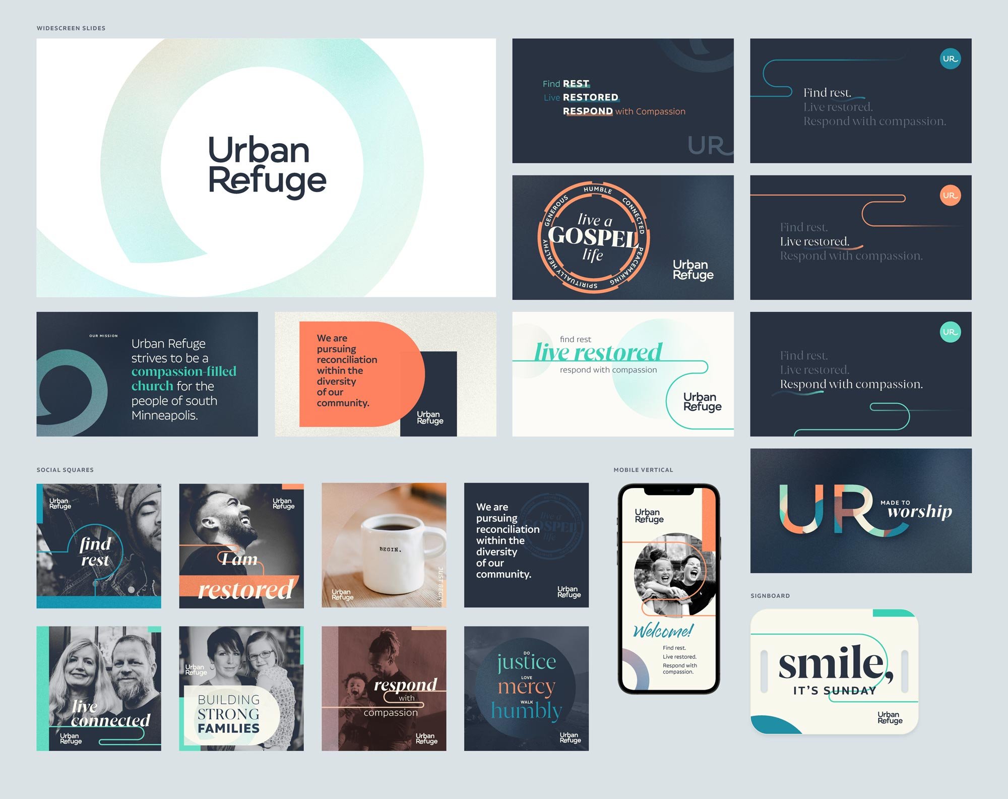
Brand Aesthetic Sample Layouts & Connect Card

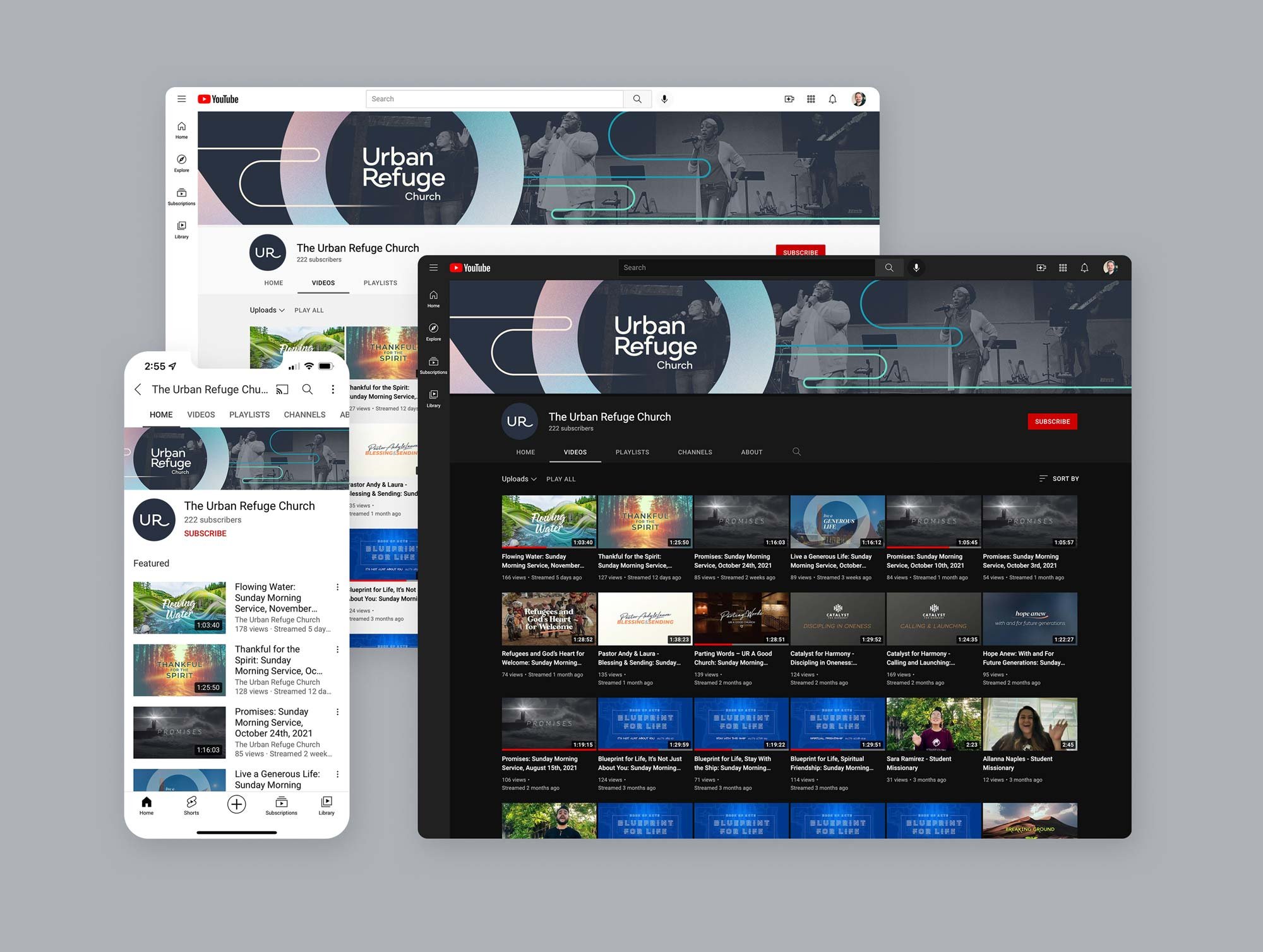
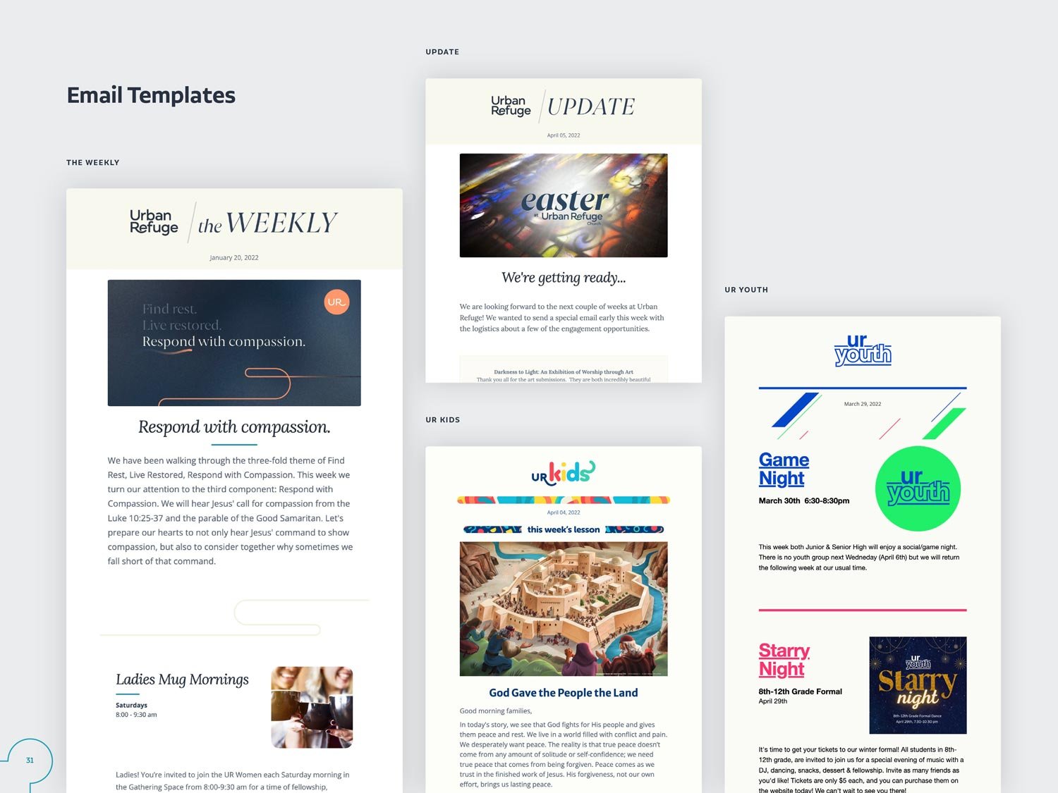
YouTube Channel Graphics & Comms Email Templates
“Jeff did such an awesome job helping us communicate who God has called our church to be. We appreciated his professionalism and flexibility as the project evolved during our time working together. It has been inspiring to see God’s hand at work during this season of change for our church. I feel strongly that the work Jeff has done will bless His church at the corner of 55th and Chicago in Minneapolis for years to come!”

