A Key Element Your Brand May Be Missing

Paying attention to a few simple rules or instructions can help us avoid potential pitfalls, frustration, and wasted resources.
I learned this well the last time I tried assembling an IKEA product without paying close enough attention to which piece was A and which was B. As you can imagine, I only got so far until I had to take it apart and start over. In terms of branding, we all know that a strong brand is one of the most important assets a business can acquire. Organizations pay thousands, sometimes millions, for a professionally-designed brand. But without some guidelines in place to keep messaging consistent, these brands can easily become diluted and unappealing to their audiences. To keep a strong, clear brand, you need a Style Guide. But what is a style guide exactly, and why should you ensure your brand is using one?
A style guide is a set of instructions for how to properly use and display your brand assets. It takes those beautifully-crafted logo files you paid top dollar for and sets a sturdy framework around them to help you achieve a unified voice for your brand. It tells anyone who will be working with your brand what files must be used, how to use them, how not to use them, and how to combine them with other elements for a cohesive presentation. The goal of a style guide is to convey the essence of your brand consistently through every touchpoint your audience has with your organization, whether in print or on screen.
Several factors can cause an otherwise successful brand to break apart or fail to impress from the start: inconsistency in presentation is the big one, but poor aesthetics in choosing support elements and sloppy construction of branded layouts can wreak havoc, as well. Without a pre-determined structure, even with the best intentions, it is often easier to muddle a brand than to maintain a professional appearance.
So what kind of instructions should a style guide include? To begin with, here are nine key directives every style guide should cover:
1. It should clearly identify the brandmark/logo(s) to be used
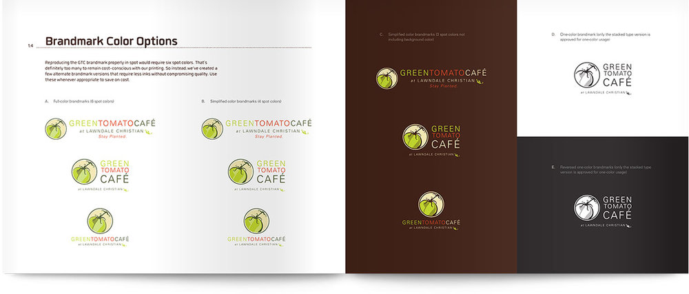
2. Show variations of the logo and when to use them
3. Identify a basic color palette that should always accompany the brand
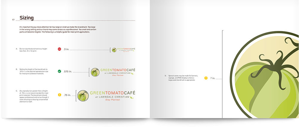
4. Set a minimum (and recommended) size for ideal reproduction of the logo
5. Define a standard clear space that should always remain free of surrounding elements that would potentially crowd the logo
6. Show several examples of what should not be done with the logo (skewing, stretching, recoloring, applying effects, etc.)
7. Define brand fonts (font families) that compliment and communicate the style of the brand
8. Provide guidelines and examples for incorporating images into branded communications
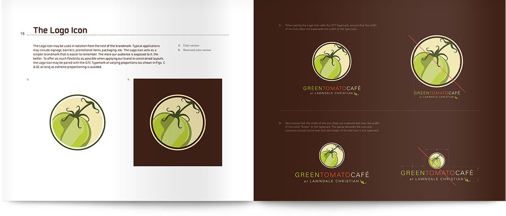
9. Provide additional guidelines for using elements of the logo apart from the full lockup (e.g. tagline or icon design)
It’s important to remember that style guides come in all sizes and differing scopes. Guides for large corporate brands can detail every foreseeable use, sometimes exceeding a hundred pages, while the simplest guides condense everything down to a single page. The best examples, however, keep it simple and straightforward while providing enough detail to avoid ambiguity. They are not totally restrictive but rather directive – they set the basic guidelines and steer the designer in the right direction without limiting creative freedom. A good style guide instructs through clearly written directions and examples, but also by the way it is designed and presented – every aspect of the design providing visual clues to the core essence of the brand.
The comparatively small fee to develop a style guide ensures that the larger investment in your brand ultimately pays off. A professionally-developed style guide will prove a valuable asset to your brand and organization for years to come.
If you're beginning to notice your brand suffering from too many alterations and too little consistency, perhaps like the IKEA furniture, it's just been assembled without proper instructions. Your best move forward is to seek out a professional who can put experience and foresight to the task and develop a new set of rules to help your brand thrive once more.
Special thanks to Green Tomato Café and the good folks at Lawndale for allowing use of their style guide for this post.


