Piecing Together Luke's Gospel

"We need sermon series artwork that can hold up for nine months, and our vision for the design is to have it look like a puzzle."
That pretty much summed up the creative brief.
My first overriding thought was how do you possibly make a puzzle look interesting on its own, much less for that length of time? I quickly recalled what I once learned from an art director who mentored me – and I paraphrase – "If it's [a puzzle] they want, then go make the best damn [puzzle] they've ever seen!"
In accepting the parameters that were dealt, I was actually freed up to consider that I could create just about anything for the design of the puzzle itself. So I set off on developing an illustration that would be intricately complex and beautiful at the same time.
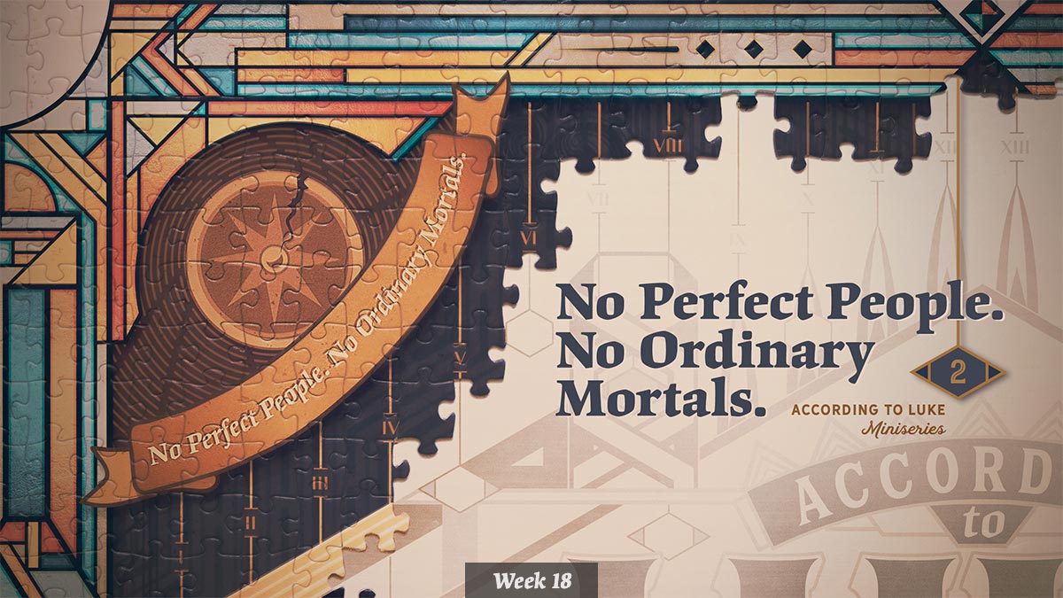
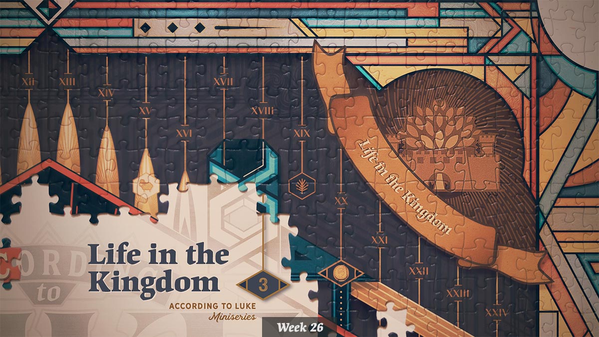
The nine-month series was a chapter-by-chapter study on the life and ministry of Jesus as told by the Gospel of Luke, interrupted every so often by a topical-related "off-road adventure," or miniseries, so to speak.
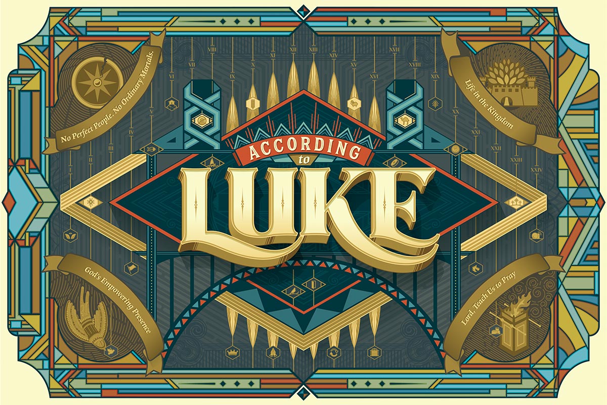
I wanted to be able to tell the story of the entire Gospel of Luke in one graphic, so I began finding inspiration in the labyrinthine line work of art deco design and early 20th century packaging. I started sketching out my own fancy framework constructed from a grid based on Luke's 24 chapters. Each vertical grid line was numbered and led to an icon that would represent the theme of that particular chapter. Along with the framework, I also sketched up some potential title treatments to add further visual interest.


Inspiration shown courtesy of Joe White, Woodgrain Studio, @gingermonkey, Justin Tran, and @JC Desevre. See my entire inspiration Pinterest board here.
Vectorizing
Once I had an approved concept of where I wanted to go, I brought the sketch into Illustrator and began drawing out my grid lines and basic structural elements. Whenever I do this, I work without regard to color, often choosing bright contrasting hues to help identify the various sections of the design, and keep a copy of these guidelines on a separate layer in case I need to revisit them later on.
I then used the Shape Builder Tool and Pathfinder palette to put my shapes together from the guidelines. At this point, I usually switch to working in grayscale to help myself build up the proper values within the artwork.
I also took advantage of the symmetry and repeating elements within the design to help build out the framework quickly.


Adding the miniseries illustrations and chapter icons
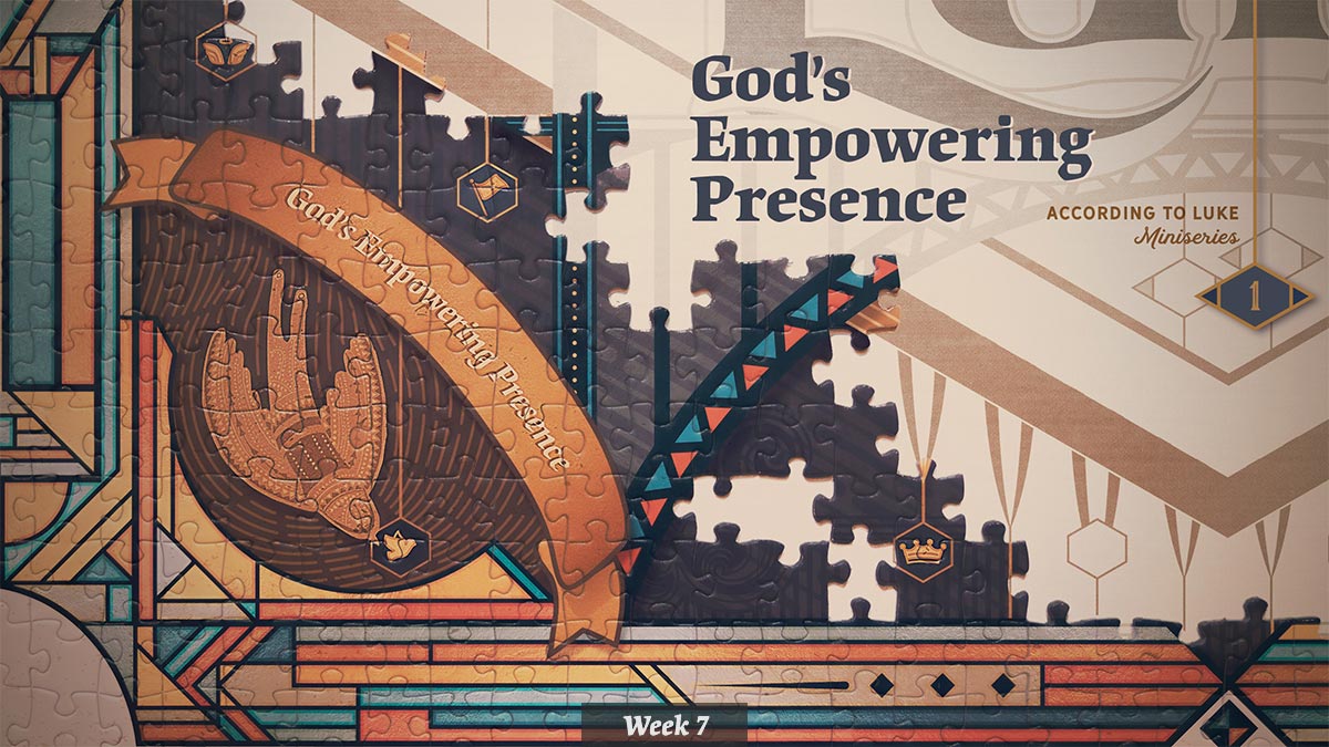
To give each planned miniseries additional interest within the overall series, I worked up four original corner illustrations (with the exception of the dove, which I modified from a stock illustration by SoNice Design [https://creativemarket.com/SoNice]) that would coincide with the topical theme of each miniseries.
In addition to that, I also needed to come up with 24 fitting icons to represent the theme of each chapter of Luke. To create these quickly, I turned to some icon sets that my buddy Joe Cavazos [http://www.joecavazos.com/] had designed along with another one by Shane Harris [http://shaneharris.me/] that got me about a third of the way. For the rest, I turned to stock resources I had onhand and modified those or created new ones from scratch to round out the set.
Coloration and finishing details
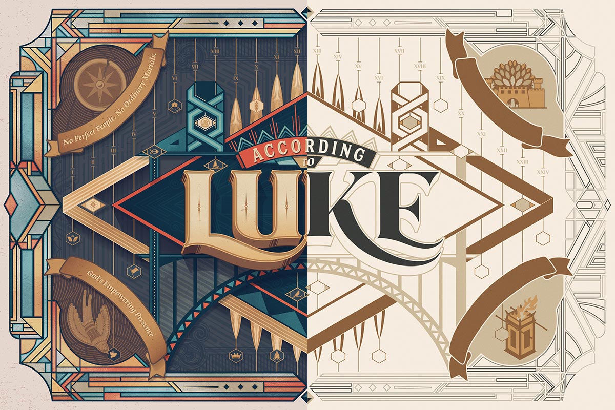
With the icons and illustrations in place, I set to work on converting my design to color. Unlike the more muted designs I referenced at the beginning of the project, I wanted to create an interesting contrast between a simplified monochromatic version, displayed at the very beginning, and a vibrant color version that would slowly be revealed as the series progressed.
I pushed the coloration as far as I could while still working in Illustrator (the Recolor Artwork tool proved handy for shifting large groups of color at once) before bringing the design into Photoshop, layer by layer, for greater fine-tune control.
Using the powerful manipulation of multiple color adjustment layers, I landed on a coloration that finally felt right, and then continued adding in the finishing details, shadowing, and textures.
For the simpler monochromatic version, I removed the icons and dimensional characteristics that were present in the full-color version.

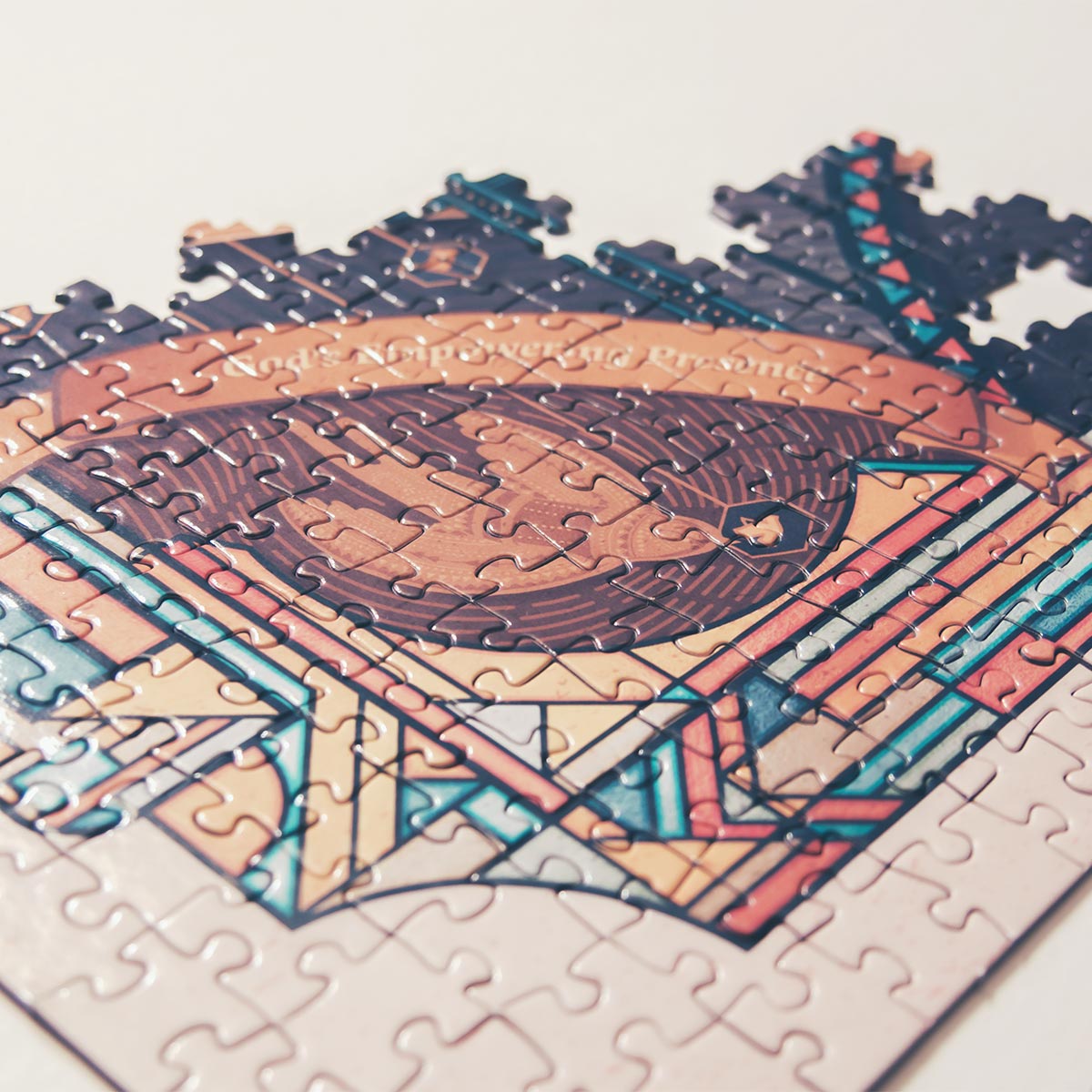
Puzzle production
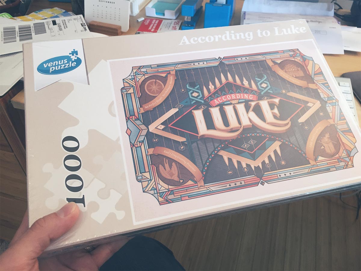
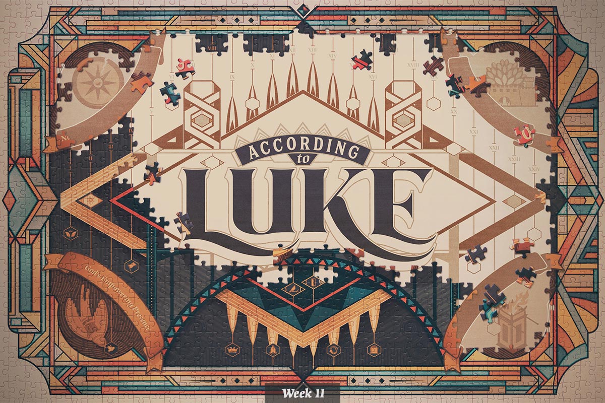
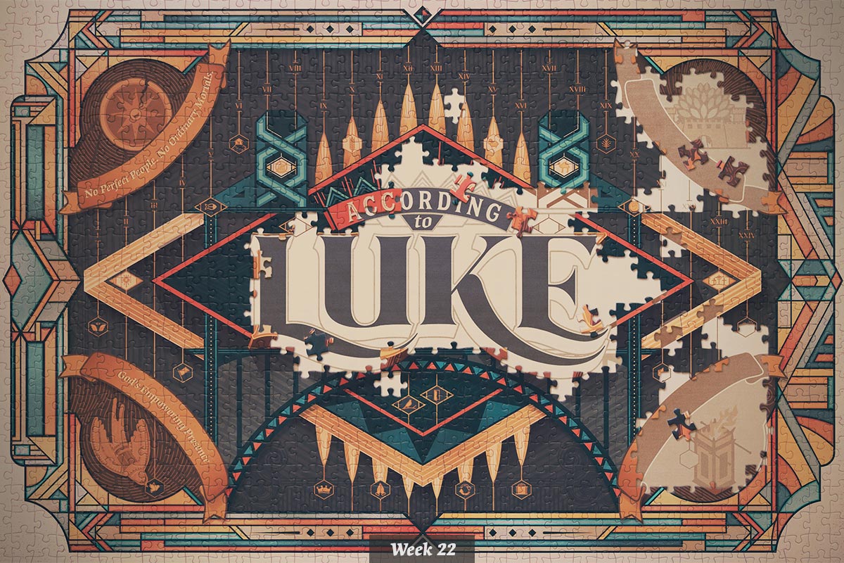
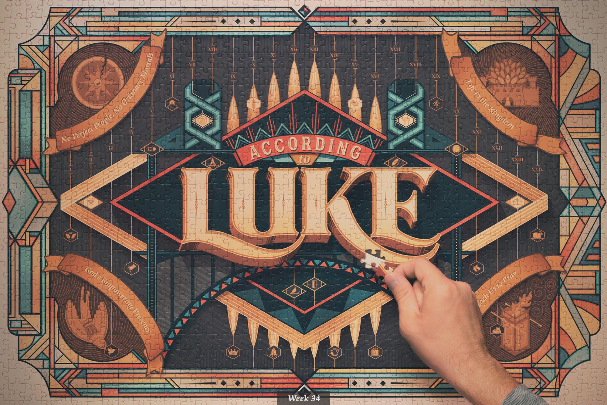
At this point, I had a polished illustration but still no puzzle. I looked up several online custom puzzle vendors, and after an initial failed attempt that resulted in a poor-quality product, I finally went with Venus Puzzle [https://www.venuspuzzle.com/] and ordered a custom 1,000-piece puzzle that printed, shipped, and delivered all the way from Slovakia in just 6 days.
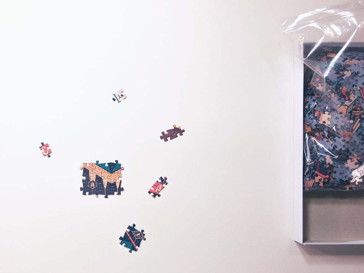
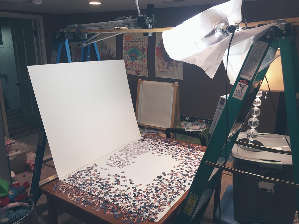
The quality of this one was very good, and with a deadline looming for the first week's graphic, I quickly set up a rudimentary photo shoot in the basement of my home and got to work on what was no small feat – putting a thousand puzzle pieces together in a precise order so I could take photos at various stages. These progressive shots would become the basis for the full set of graphics for the series.

Final image generation
The post-production work involved isolating the puzzle pieces from the white background and inserting the monochromatic design as the final backdrop. I also spent some time removing glare from the glossy-surfaced pieces and performed my final color tinting.
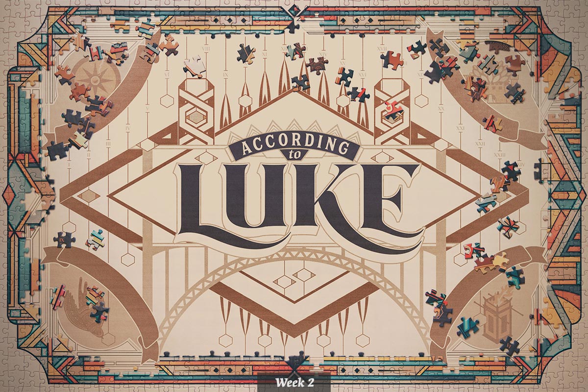
As the series progresses, the idea is that the puzzle will come together section by section, ultimately revealing the more detailed title design in the final weeks.
See below for the finished 36-week visual journey.

Miniseries Graphics

“I knew if there was anyone capable and willing to dive deep into a big project like this, Jeff would be that person. We met a few bumps in the road (because of the complexity) that, together, we moved past. And the final product was just what we needed and just what I envisioned.”