Faith in the Trenches

My wife and I spent the month of January in Memphis, TN.
While she was completing a medical rotation, I met with the executive director of CCHF (Christian Community Health Fellowship), an organization that encourages medical service to the poor and connects docs and other medical professionals who are involved in such work with helpful resources. Each year, they put on a conference that attracts doctors, nurses, residents, and med students from around the country and seeks to inspire them to follow Christ in serving the underserved.
As the director explained it, many hear the call to go into this type of work early on in their careers, but hardship and years of seeing little impact can cause some to doubt the call or even abandon ship. He wanted this year's conference to identify with the struggle and hardship while encouraging these doctors to press on and fight the good fight.
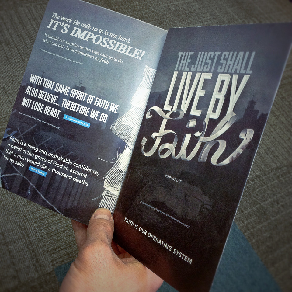
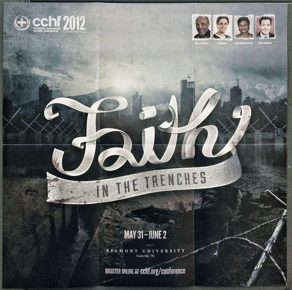
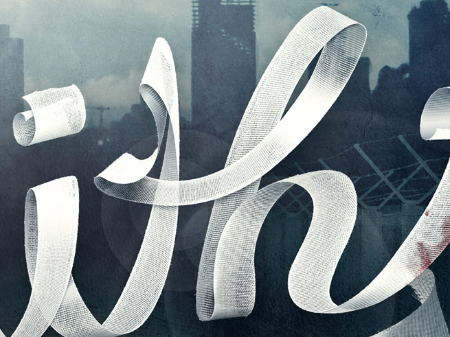
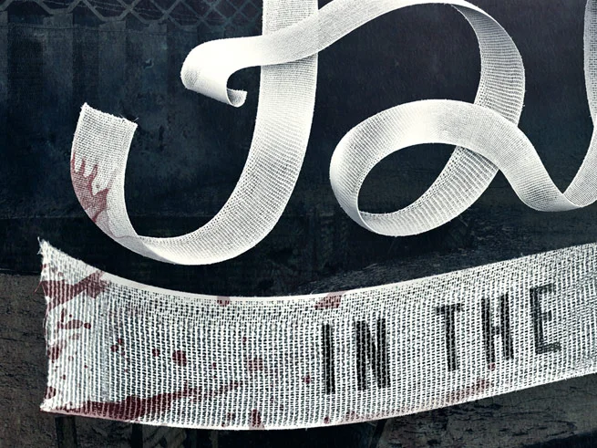
We teamed up and I worked on creating the visual concept for the 2012 conference theme of "Faith." Much like on a battlefield, many of these health providers are on the front lines, working among the most at-risk populations, taking financial hits, and facing many blockades to achieving their goals. At times, they can lose sight of the reason they took up the fight in the first place, feeling alone and isolated. I decided to represent the fight literally with the trenches, battle fences, barbed wire, and concrete walls. But to give the piece that much-needed sense of hope, I created the word faith out of medical gauze, signifying the binding up of the wounds they had sustained, and adding a beacon of light to pierce the darkness. The director liked this direction and even decided to alter the title of this year's conference theme to "Faith in the Trenches."
Once the graphic was complete, I set to work on implementing the elements of the illustration into the layout of the conference brochure. The brochure was a tri-fold piece that folded out to reveal a 16x16 poster of the illustration on the inside. The poster was meant to be a striking reminder of the upcoming conference that could be tacked up to bulletin boards in offices and break rooms, keeping it at the forefront of people's minds as the conference grows near.
The brochure was printed using a digital press on a smooth matte coated sheet for the best possible reproduction. Now that the brand and theme have been established, I'm looking forward to potentially attending the conference myself along with Meghan who has gone twice already. It was a great opportunity to work on something we are both passionate about, and I look forward to seeing how it all turns out come May.


