Building a Shoe

I love doing work for non-profits, but even more so when the project entails promoting a fun event like the annual Lawndale 5K race.
I started designing for Lawndale Christian Health Center last summer and my ad illustration promoting last year's race was our first project together, although I was too late to the game to design the rest of the promotional materials for the race as they had already been completed. So I was pretty excited when they approached me again this year to not only design the race graphic but also all the materials to go with it.
We started in early spring with a refresh of the race logo and color palette. I took their existing logo and simplified it while crisping up the graphics and adding clarity to the text. I presented several color options, and we eventually landed on the bright orange for a fresh feel for this year's race.
Updates made to the 6th Annual Lawndale 5K Walk/Run logo.
Once the logo was ready to go, it was time to begin concepts for the promo graphic. The rough sketch below immediately stood out as the frontrunner for the final design. The client liked the idea of personalizing an ordinary running shoe sole with name of their event, so I set out to make it happen.
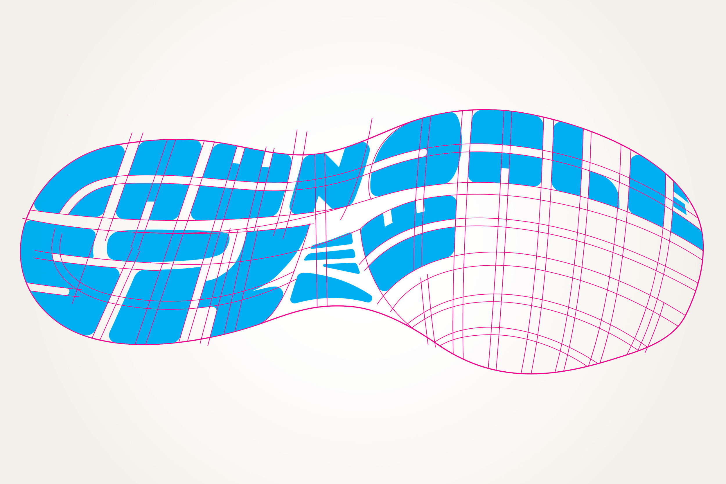
Starting with an image of my own running shoe, I built a vector grid onto which I could construct all the letterforms.
Once the letters were finished, I added the colors from the new color palette.
To make it feel like a real athletic shoe sole, I added some depth and texture with various 3D shapes, shadows, and patterns. At this point, the illustration was still completely vector.
To take it to the next level, it was time to hop over to Photoshop where more shading, shadows, and background textures were added to get it to pop off the page a bit.
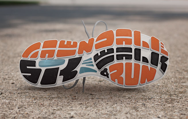
I was pretty happy with it at that point and thought the clean look would lend itself well to the poster design. However, for the direct mail postcard, I wanted to see if I could take it one step further and illustrate the shoe in a photorealistic style. Starting with a shallow depth-of-field shot of my driveway, I began creating an environment for a shoe turned over on its side.
After adding in some dramatic lighting, image softening, and believable drop shadows, the result is what you see here.
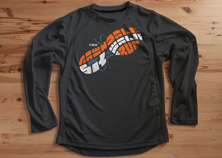
Below are the final applications of the illustrations into the layouts of the direct mail postcard and poster. Because the race takes place in a diverse neighborhood near downtown Chicago, the copy was also laid out bilingually. I also applied the basic vector illustration to the free tech shirts given out to race registrants.
I definitely had a fun time designing and building the shoe graphic and laying out each piece for the campaign. In fact, I was so into it that I actually started a new routine of working out and running in the mornings during this project that I'm still going strong with today. So thanks, Lawndale, for inspiring healthy habits even for me!


