Building a Brand: Identity

In my last post, we took a first look at the birth of a new brand through the lens of product development. Now we'll walk through the process of creating the actual identity for the brand through logo design and establishing various brand elements.
As I set out to begin working on the logo for Thrive, I had many discussions with the client up front about how we wanted to position the brand long before my pencil ever reached the paper or I opened up Illustrator. The brandmark needed to reflect the connectedness and fluidity of using the product itself. It needed to express the essence of the word "thrive"… something growing, flourishing, and advancing. It needed to have a simple, but memorable icon that would bring instant brand recognition. It needed to be able to stand apart in an already saturated marketplace of other faith-based web and print template services. And not least important, it needed to look cool, modern, and techy while eliciting a positive response.
From these back-and-forth conversations, I began sketching out some rough ideas. Here's one that struck me early on as a wordmark with the potential to embody the brand values we were hoping to achieve.
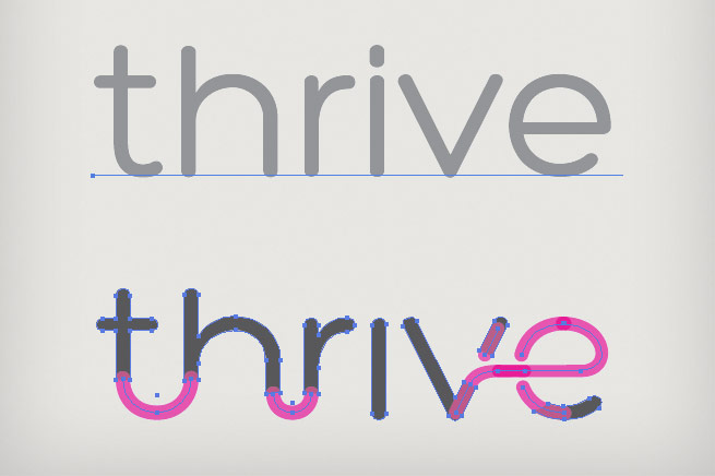
From the sketch phase, I began searching for the right typefaces and font styles that might work as a starting point for further customization. Below, you can see how one particular font was transformed into a more fluid, unique wordmark.
The next step was to begin experimenting with different icon designs and pairing them up to various wordmarks and fonts. For the sake of presentation, I decided to go with the same color palette for each option to eliminate color from becoming the deciding factor between the different concepts. Here are some of the concepts and concept variations presented at this stage in the project.
From this point, it was decided that the droplet icon was visually the strongest and also the most open to interpretation. Depending on the color we chose, it could represent a flame (energy, light source, ability to spread quickly), a drop of water (the key ingredient for life, something clean and clear, ability to take on different forms), and a leaf (the idea of growth, something lush, healthy, and organic), to name a few.
After much consideration, we chose green because of how well it communicates growth and life, which ties it in perfectly to Thrive's vision of helping churches experience new and exciting growth through better organization and more effective communication. The color green also created a clear connection to the parent company's branding (Axletree Media) which also uses green as one of its corporate colors.
The final step was putting the wordmark and the icon together with the right spacing, proportion, and alignment to create a balanced trademark.
In addition to branding Thrive, there was a second entity in need of similar branding that we worked on at the same time. Hive is the name given to a community learning forum encompassed within the Thrive application. Though not yet released, once completed, Hive will feature a collection of blog-like articles, resources, and discussion threads focused on church communication best practices. The Thrive icon quite naturally dovetailed into the mark for Hive – not only does the droplet mark closely resemble a beehive shape when turned upside down, but I was able to create a honeycomb shape using the negative space surrounding a group of Thrive icons arranged in a circular pattern. Before we knew it, we had the perfect logo for this sub-brand.
So we had Thrive and Hive figured out, but now there was also a third element that was like the fabric holding it all together. This third component was a six-step method that any church using Thrive could adopt and implement in order to "Achieve Momentum" (this phrase became the identifying name of the method). The Thrive and Hive products themselves encompassed one or more steps along this path. To help illustrate this more clearly, I was asked to come up with a series of three graphic diagrams to show how the method is ingrained in every part of Thrive. The first diagram shows the method standing on its own with the various steps, and illustrates the cyclical nature of this philosophy. Further explanation is still necessary to fully comprehend what each step entails, but this diagram serves to visualize the method as a whole. The second diagram superimposes the steps of the method over an embellished version of the Thrive logo, almost like a cross-section of the brand itself. The third diagram does the same thing with the Hive logo, again focusing on the cyclical direction of the six steps.
The final stage of creating the brand identity was to bring all the pieces together in one place. Before the launch of the official website, I helped create a simple landing page that introduced the method, the community, and the product as one exciting, new unified brand. At the bottom of the page were social links and an email signup form. Not only did this webpage design help to introduce the brand, but it gave me the opportunity to work out various brand elements (such as color palette, fonts, textures, and other styles) that would carry over to subsequent branded materials.
Check in next week for the final post in this three-part series as we explore the process of designing the touchpoint between brand and consumer… the Thrive website.


