Building a Brand: Web Presence

Welcome to the final article in this three-part series on building a brand. Since some time has passed since the first two… let's review.
In part one, we saw that a brand begins at the level of the product it represents. If the product is poor, then no amount of fancy design or clever marketing is going to make up for that. But if the product is strong, the brand can built on top of an already solid foundation, fueling the creative process and bolstering the results.
In part two, brand identity came into play, and we set out to explore the process of designing a family of logos and branded illustrations that would communicate the appropriate messages to our intended audience and leave them with a memorable, and hopefully favorable, impression.
Today, I'd like to walk through how we began bridging the gap between this new fledgling brand and the consumer. As with any product or brand, there must be a point where a response is requested or required of its audience. In this case, we wanted to create greater awareness about Thrive and its capabilities, but we also wanted to create an avenue for customers to begin purchasing and using the product. To do this, we began working on designing a storefront website that could quickly explain and introduce Thrive, showcase its features and theme designs, provide pricing information to potential customers, and finally close the sale (or direct them to chat with a real person who could do so).
To begin with, we had to clear out the clutter. There was a lot to communicate about Thrive and its sub-entities, but what was absolutely necessary and what was superfluous or potentially confusing? On top of deciphering all of that, I was being commissioned to design a separate site for Hive, the community learning forum, simultaneously. Questions like how the two should interact and overlap were also in need of being addressed.
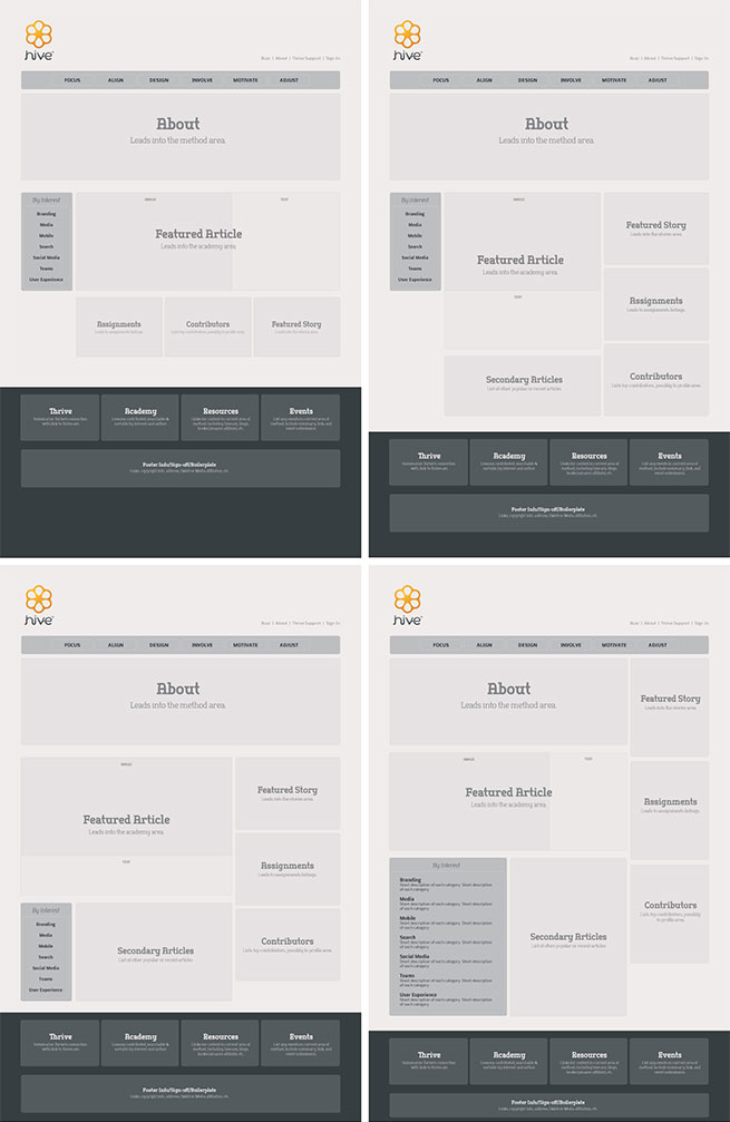
I began by putting together a series of wireframe designs to help us visualize what might go where and what might get prominence over another. Wireframes are helpful because they mitigate some of the critical decision-making up front about how content should be arranged before a lot of time is invested into a design. Here are some of the early wireframes developed for the Hive site.
For the Thrive site, the wireframes took on a little bit more of a graphic feel (but very simplified) because we already had some design cues from the simple landing page I had designed in the branding phase. These early wireframes were built under a shared assumption that all three aspects of Thrive (the method, the community, and the software) needed to be communicated in a flowing, single-page style design.

Early Thrive wireframes

Early design based on the three-in-one idea
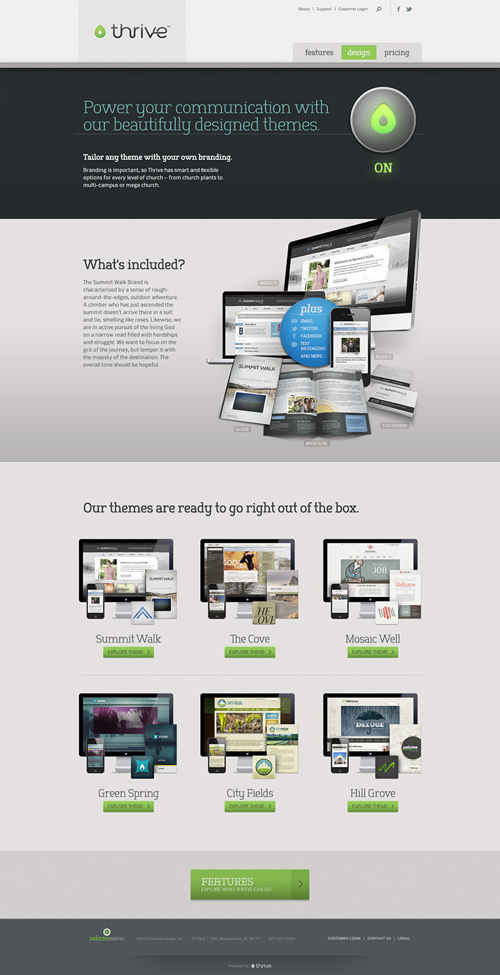
We eventually came to the conclusion that we needed to simplify and only talk about the software itself. Ideally, these major shifts in thinking come during the wireframe stage, but that is not always the case. Sometimes it takes designing it one way and giving the client something to clearly envision in order to come to the conclusion that there's a better way to do it. While not always fun, and not always economical from the client's perspective, it's necessary to allow the project to evolve and to make sure we're getting it done right. As you can see below, the end results often justify the painstaking means required to arrive at the best solution.
Here's a few screenshots of the final Thrive website design. As you can see, we simplified the main navigation to just three links, with the home page serving as a visually eye-catching introduction of the product and the subsequent pages highlighting the rest of the key features, theme designs, and pricing info.


To see more of the final design, check out the full project in my portfolio.
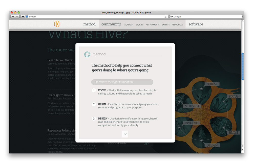
Finally, here are a few in-progress screenshots from the Hive website design. Work has stalled on this project, unfortunately, but should it ever pick back up, we should have a solid starting point with these designs. Of course, decisions to simplify or alter the site structure could still occur, but that is all part of the design process.


While this series of articles is certainly not exhaustive or indicative of any certain "formula" to creating a strong, competitive brand, I do hope it allows you to catch a behind-the-scenes glimpse of the process and maybe even inspire you to create a winning brand of your own.